HEALTHASSIST
A mobile app aimed at improving public awareness of self-healthcare by offering users accessible information on major and common diseases. The app also includes a location-based feature that helps users find nearby hospitals and pharmaceutical stores.
Role
UX Designer
Owner
Self
Platform
Mobile
Toolkit
Figma, Figjam, Maze etc.


Project kickoff
This project address the real life challenges in India related to basic self health care. The project began with the background research where I user secondary research method and defined the problem statement.
Problem statement
India is 2nd largest highly populated country (2021) in the world but as compare to population, healthcare facilities provided are inadequate. India ranks 145th in quality and accessibility of health service globally where as many as one third of the deaths are preventable with timely communication about availability of medicines. Every year approximately 1.6 million people die in India due to lack of accessibility to healthcare facilities.
Design brief
Design a comprehensive healthcare app tailored for Indian users across urban and rural regions. The app provides accessible medical information to help users understand diseases and basic treatments, and includes a feature to locate nearby healthcare facilities offering the required care in both emergency and non-emergency situations.
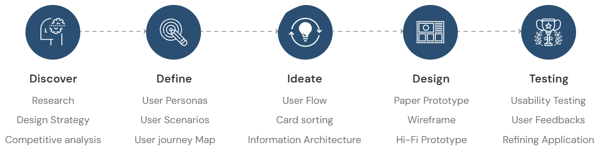
My design process for this project
Discover
Research
Design Strategy
Competitive analysis
Define
User Personas
User Scenarios
User journey Map
Ideate
User Flow
Card sorting
Information Architecture
Design
Paper Prototype
Wireframe
Hi-Fi Prototype
Testing
Usability Testing
User Feedbacks
Refining Application
General research
Number of smartphones used in India - 748 Million in 2020 but people don’t have basic knowledge about self healthcare. Talking about facilities provided by government there is 1 Government doctor for every 11,082 people, 1 bed for every 1,844 people, 1 Government hospital for every 1,55,595 people. In some regions there are not even government hospitals which tends to death ratio to be more in that area. Catering this entire problem will cost lot of time so there should be something which will help to educate people to overcome the healthcare issues.
Possible need
Need an app which will give basic
knowledge or idea of first aid
incase of emergency.
To create awareness about
healthcare system.
Suggest closest hospital nearby which has facilities available to
treat the patient.
Need to locate nearby pharmaceutical
store which has medicines
available as per the need.
Need to provide appropriate
information about home remedies & medicines to treat patient.
Design strategy
Project Overview
This project is about making users to get proper guidance about self healthcare also user can get free medical advice in case of emergency. Moreover user can freely browse through other free medical treatment which can be cure at home also user can look out for nearest pharmaceutical store and hospital which has cure to user disease.
Target Audience
Working professionals, Housewifes, Students, basically all type of users who can
access smartphones.
Gender: Male, Female, Transgender.
Profession: Working and non-working both.
Age group: 18-45 years.
General Tasks
Major task is guiding user through first aid treatment in case of emergency other
that that user can browse through healthcare activities, first aid during
emergency, can add emergency contact, read daily blogs. User can also create
account to track other things.
Technology Constraints
Internet, Smartphones required. Small town where there is network issue may
face problem to access the application.
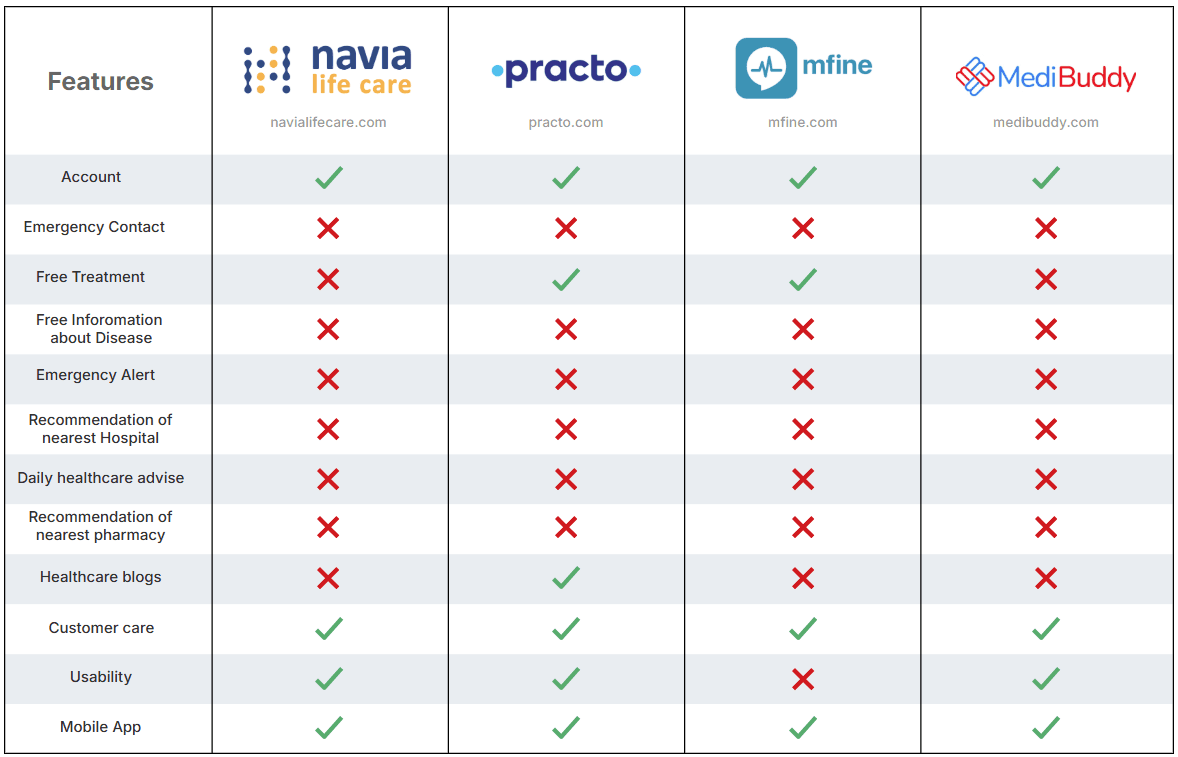
Competitive analysis
In Competitive analysis phase I assessed strength and weakness of current and potential competitor. I did a research looking for a similar applications and compared 5 apps of which 4 of them were strong and did the analysis to get useful insights from it also I noted negative comments from users on Android playstore to get essence of what user struggle most while using them and what they are not keen to.


Low Features
High Features
High User Experience

Low User Experience
navialifecare.com

practo.com

mfine.com

medibuddy.com
Features
Account
Free Treatment
Emergency Alert
Mobile App
Usability
Customer care
Healthcare blogs
Free Inforomation
about Disease
Recommendation of
nearest Hospital
Recommendation of
nearest pharmacy
Daily healthcare advise
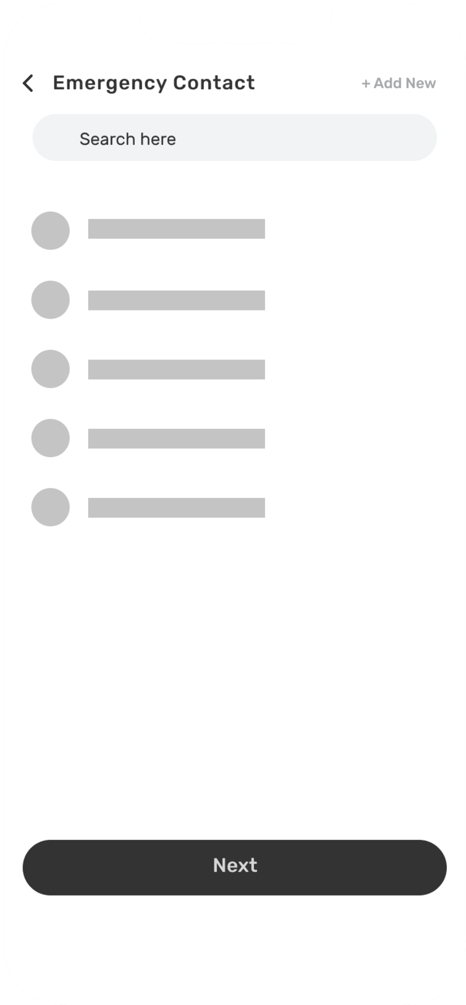
Emergency Contact
Gathering insights

Positive Points
All the applications
have professional
doctors with
paid consultancy.
User can get
online treatment
from home.
User can order
medication online.
Doctors available
who can speak
different regional
language.

Pain Points
No other app than
Practo provide free
medical treatment.
No option of first aid incase of emergency.
Don,t have much
option mostly all
of them are paid.
No feature of
emergency contact
incase of emergency.
User personas

Jay Patel
Age : 45
Status : Married
Goals
There should be platform where one can get basic knowledge about preventive measures to be taken incase of emergency.
Get more suggestions about the Major and Minor disease and it’s remedy.
Pain Points
No proper app available which will help incase of emergency.
Other application are available in market but mostly provide paid services.
No notification about healthcare

Pooja Sharma
Age : 28
Status : Married
Goals
To have basic understanding about Minor and Major Disease.
To know what preventive measures can be taken to cure minor symptoms.
To increase her knowledge about self healthcare.
Pain Points
Visiting doctor for minor symptoms is not affordable.
No app available which will provide information about common symptoms.

Sahil Shah
Age : 22
Status : Student
Goals
To have basic understanding about Minor and Major Disease.
To know which hospital has facilities which can sure his problem.
To know which of the pharmaceutical store has medicines available according to his need.
Pain Points
Hard to find better hospital and pharmaceutical stores.
No proper information available about self healthcare.
User scenarios
Jay Patel - Scenario 1
Jay Patel’s father is old and his health is unpredictable. His father sometime goes through symptoms which Ashutosh and his wife are unaware of. So they would like to have an Mobile App which will help them to know what are those symptoms leading to and how to tackle that situation incase on emergency. They would also like to know what are the possible treatments available for the symptoms.
Sahil Shah - Scenario 2
Sahil lives in a small town called Auroville where healthcare facilities are very poor. He feels severe pain in his back and would like to use Healthassist app to search which hospital available near by that has all the facilities available to cure his illness.
Sahil was taking medications of back pain and now he is having just one day of medication remaining. he would like to use Healthassist app to search for local pharmaceutical store which has the medicines available he needs.

Pooja Sharma - Scenario 3
Pooja is an independent lady and has lot of workload and forgets to looks after her health. After her hectic work pooja comes home and feels mild headache. She would like to use some Mobile App and want to know just by sitting at home that how she can cure mild headache and what are the treatments available .
Hierarchical Task Analysis
Hierarchical Task Analysis were made taking scenarios into consideration. Every flow demonstrates how user will navigate in a particular environment to complete his task.
Scenario - 1
Download app from play store/ios store
Completes Sign up
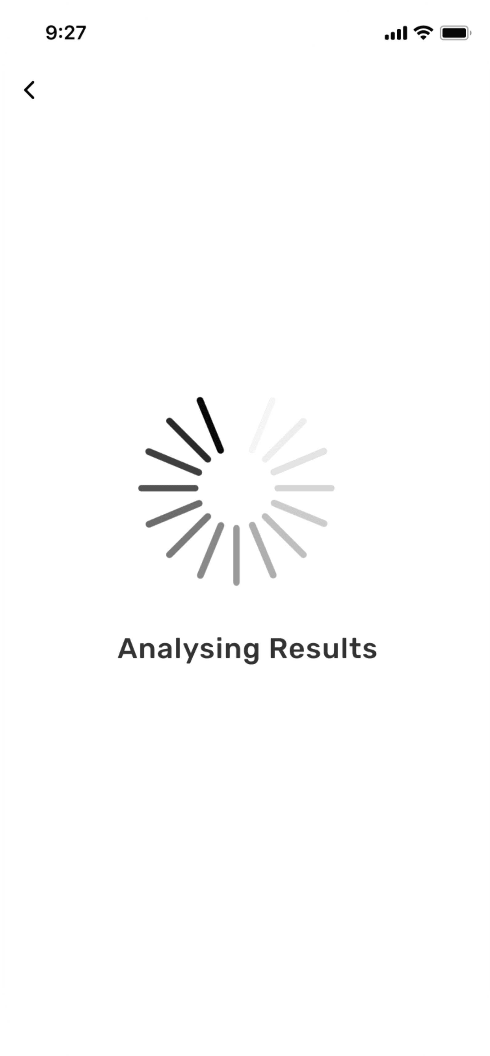
App analyses symptoms
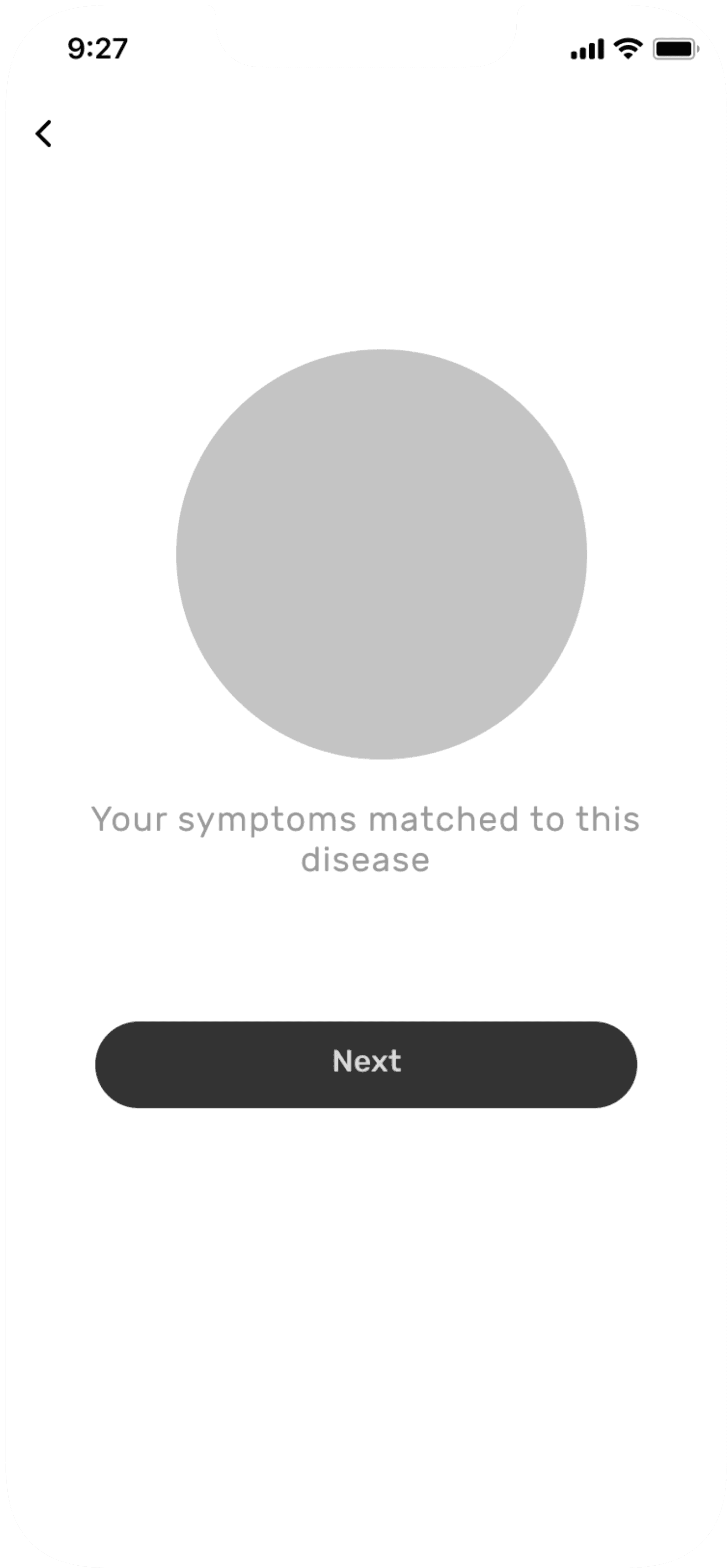
Final Results
Open HealthAssist
App
Submits search/
selection
Gets result which matches search
Homepage
Select or types the symptoms
Scenario - 2 Task 1
Search result
List of Hospitals
Click
Type the issue in search box & app will suggest list of hospitals which has treatment available
Homepage
Nearest Hospital
Search Hospital
Scenario - 2 Task 2
Search result
List of Hospitals
Click
Type the medicine required & app will suggest list pharmacies which has medicines available
Homepage
Nearest Pharmacy
Search Hospital
Scenario - 3
Selection result
See the basic info and required treatment
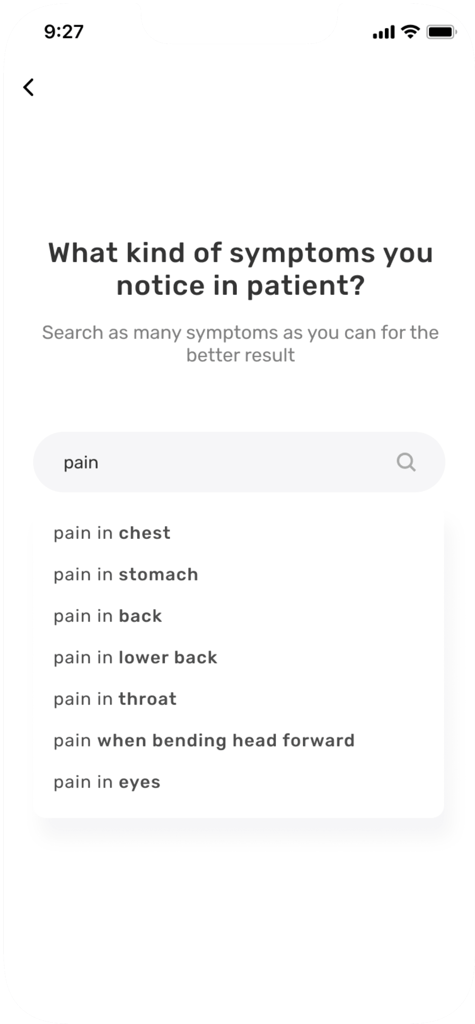
Search for
symptoms
Select
symptoms
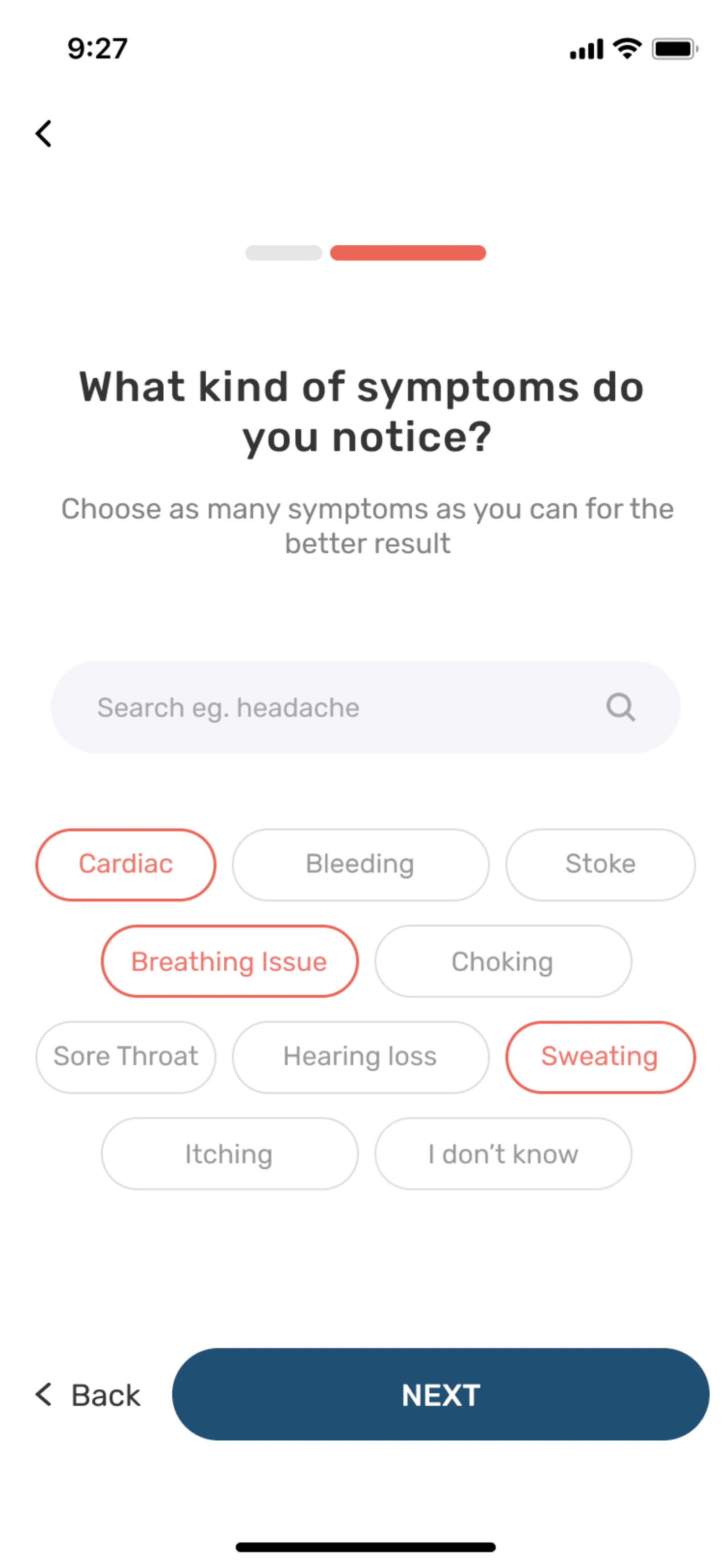
Homepage
Common Symptoms
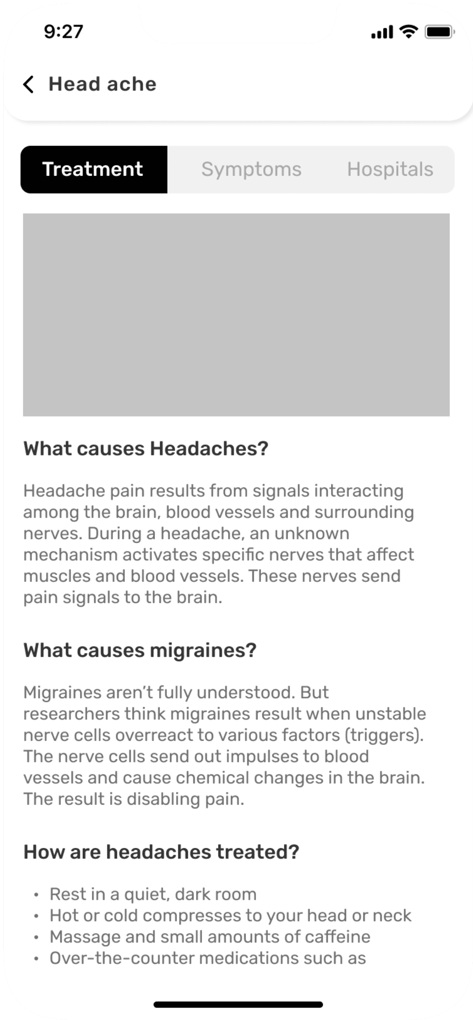
Headache
Affinity mapping
I did Affinity Mapping exercise to categorise required information and features. Below is an example of it.
Homepage
Home, Search,
Notifications,
Account,
Emergency help
Nearest hospital,
Nearest Pharmacy
Emergency Contact
option
Common Disease,
Emergency Disease,
Health & Care
Latest blogs
related to
Healthcare
Suggestions of top
Hospitals available
nearby
Emergency Disease
Search bar to
search for
symptoms & list of
symptoms
Different options
of symptoms
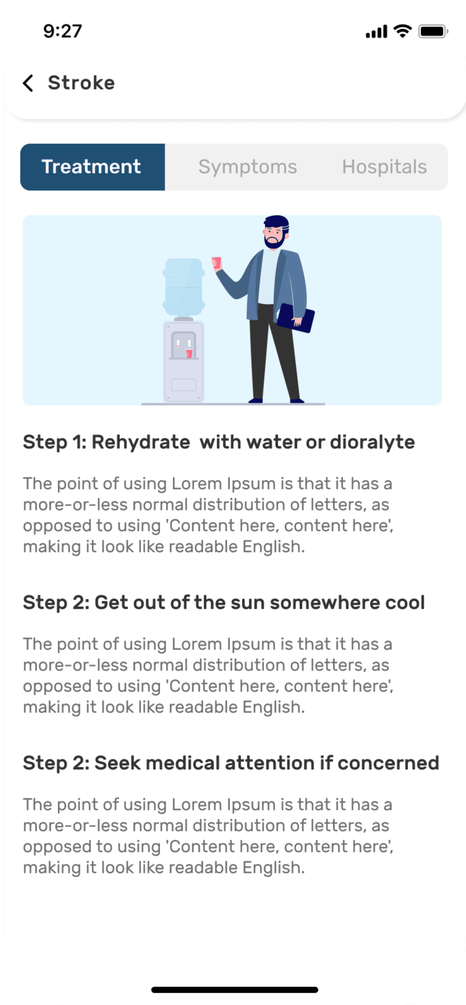
List of precautions to be taken incase of emergency
Graphical
representation of
treatment
Video of
treatment
Option of text
reader as well as
of call ambulance
incase of emergency
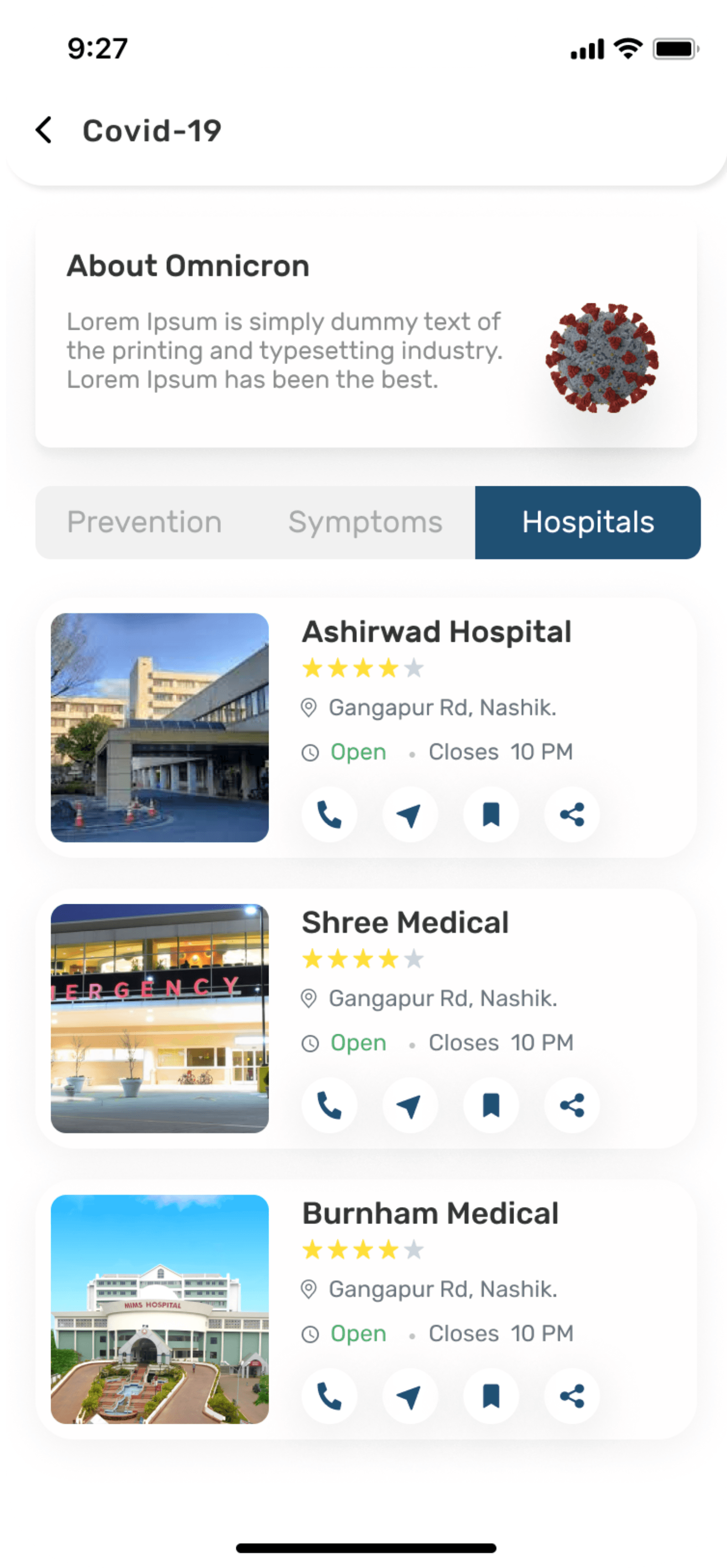
Common Disease
List of common
Diseases
Graphical
representation
of treatment
Detailed explanation of treatment
Video of
treatment
Option of text reader
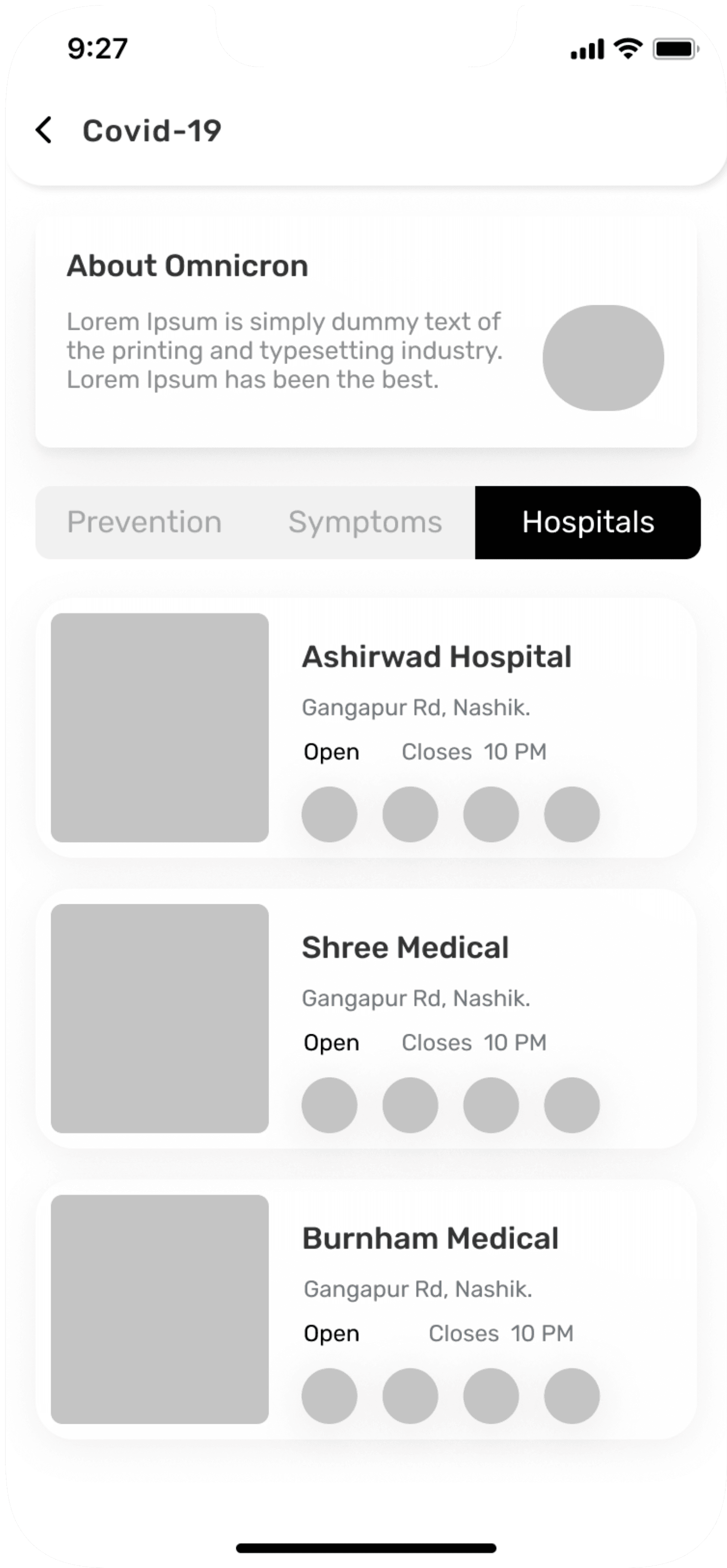
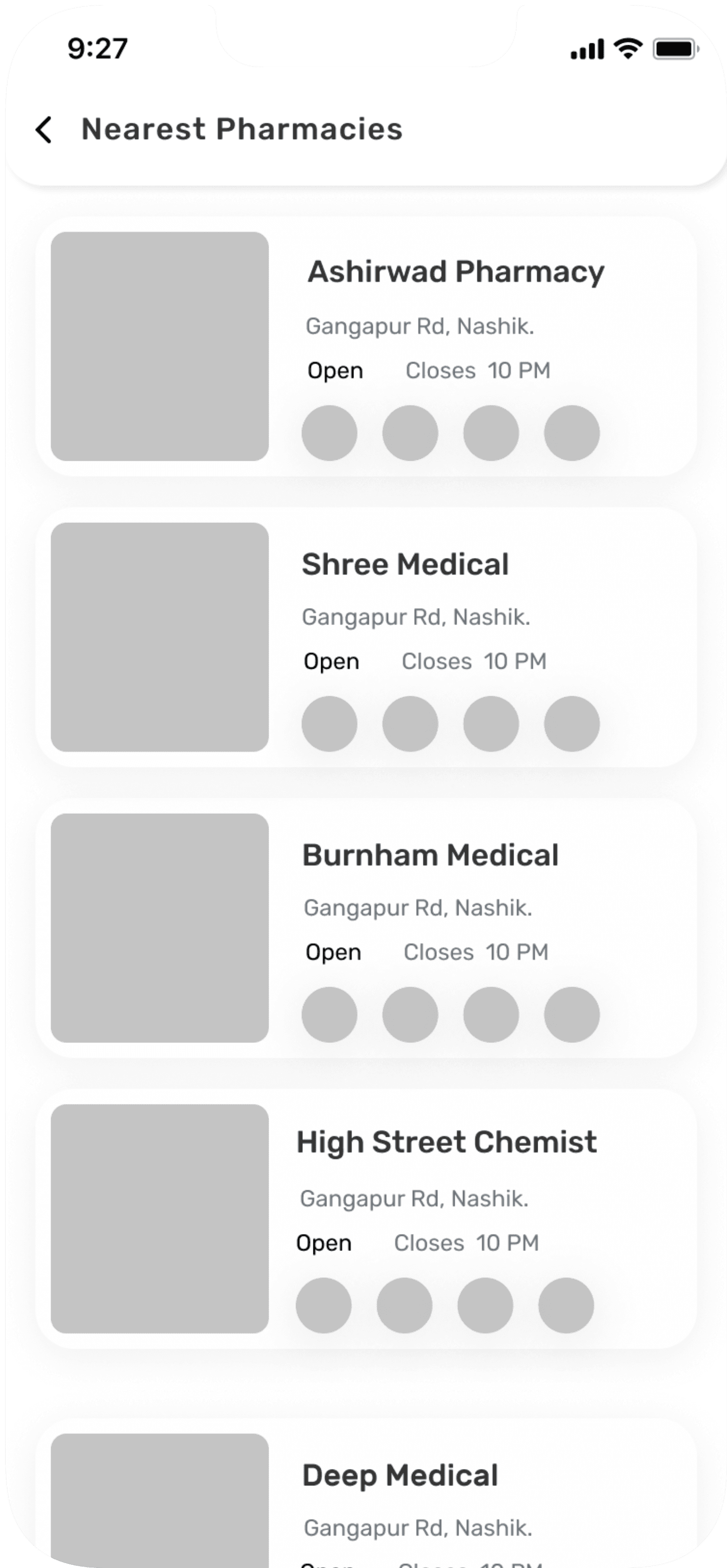
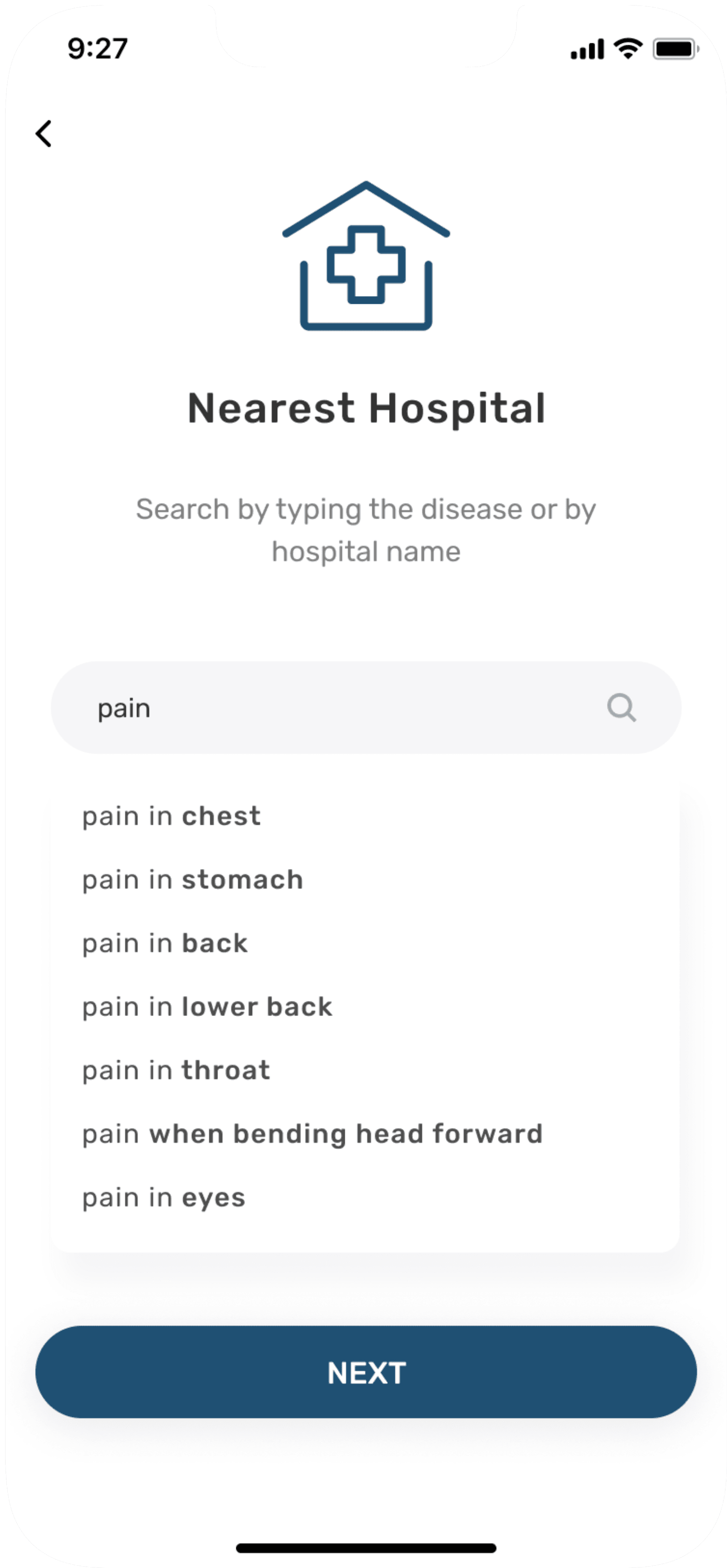
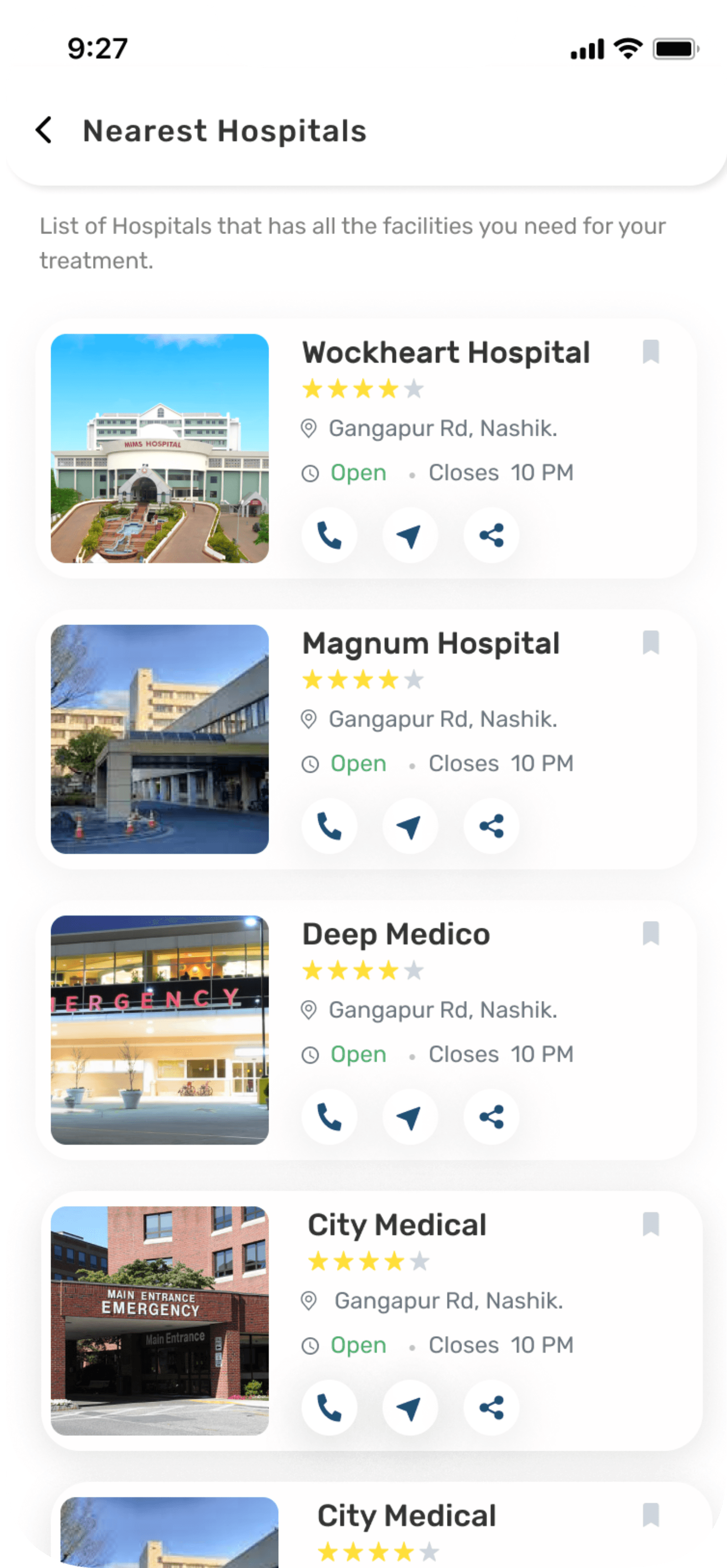
Nearest Hospital
Search option to
search for treatment
available in nearby
hospitals
List of hospital
available nearby
Information about
hospital address
and timings
Option of calling,
get direction,
and share
Save option to save best hospital available or
according to the
need
Nearest Hospital
Search option to
search for available medicines in nearby
Pharmacy
List of pharmaceutical
store available
nearby
Information about
store address
and timings
Option of calling,
get direction,
and share
Save option to save best Pharmacy available
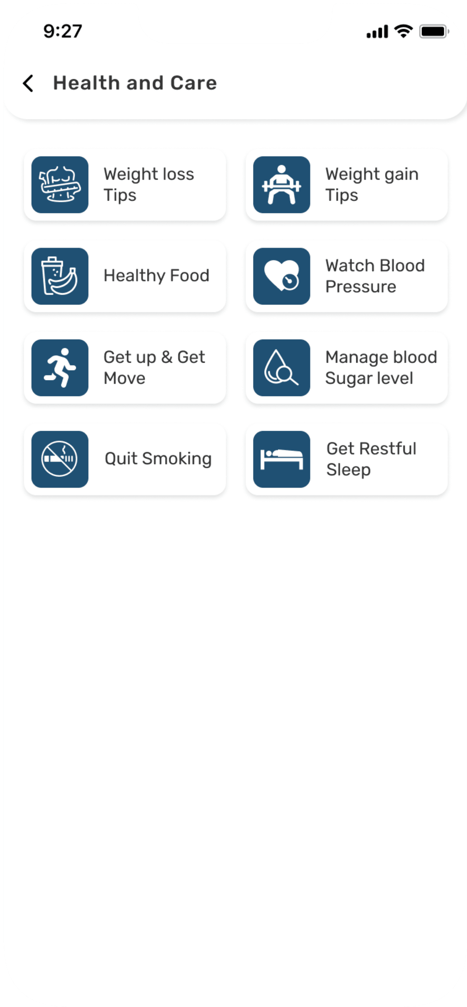
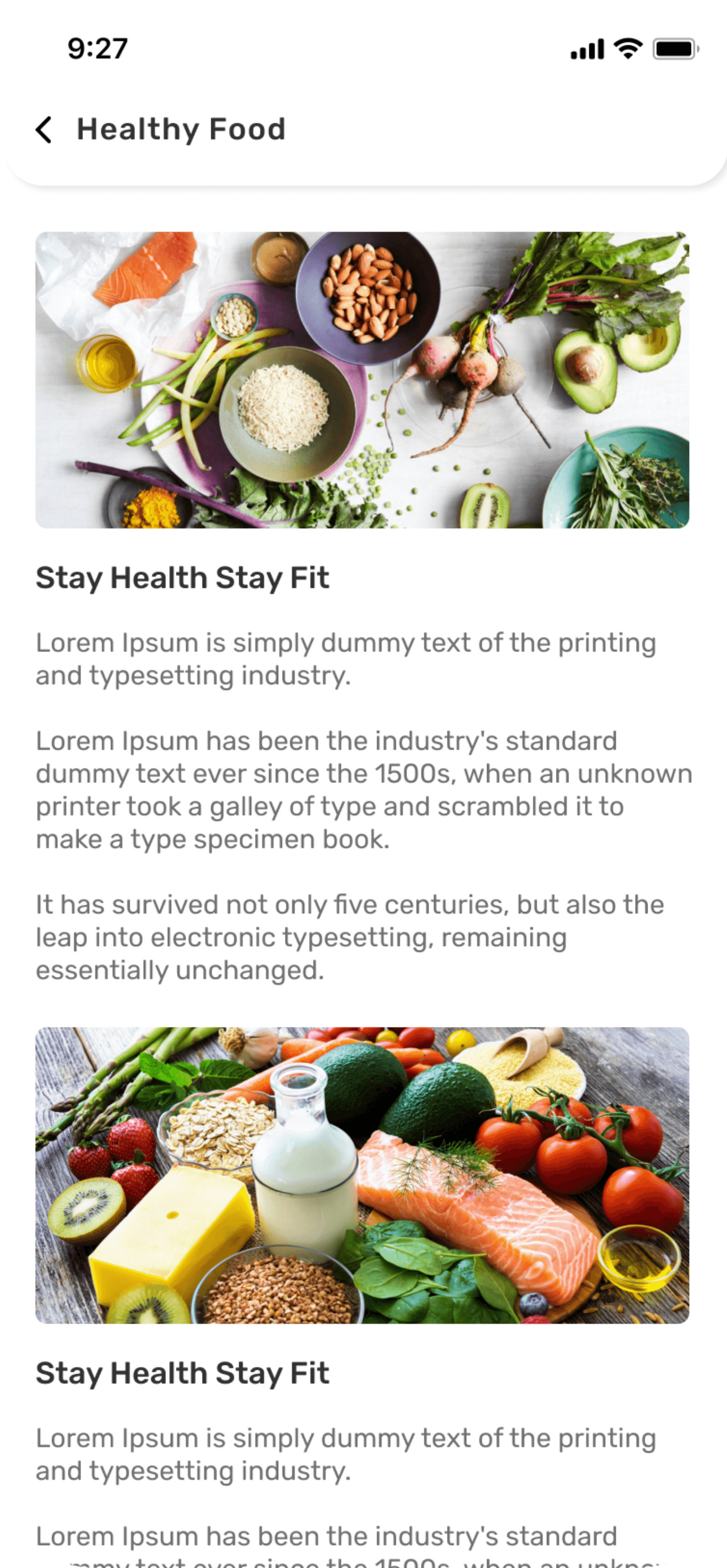
Health & Care
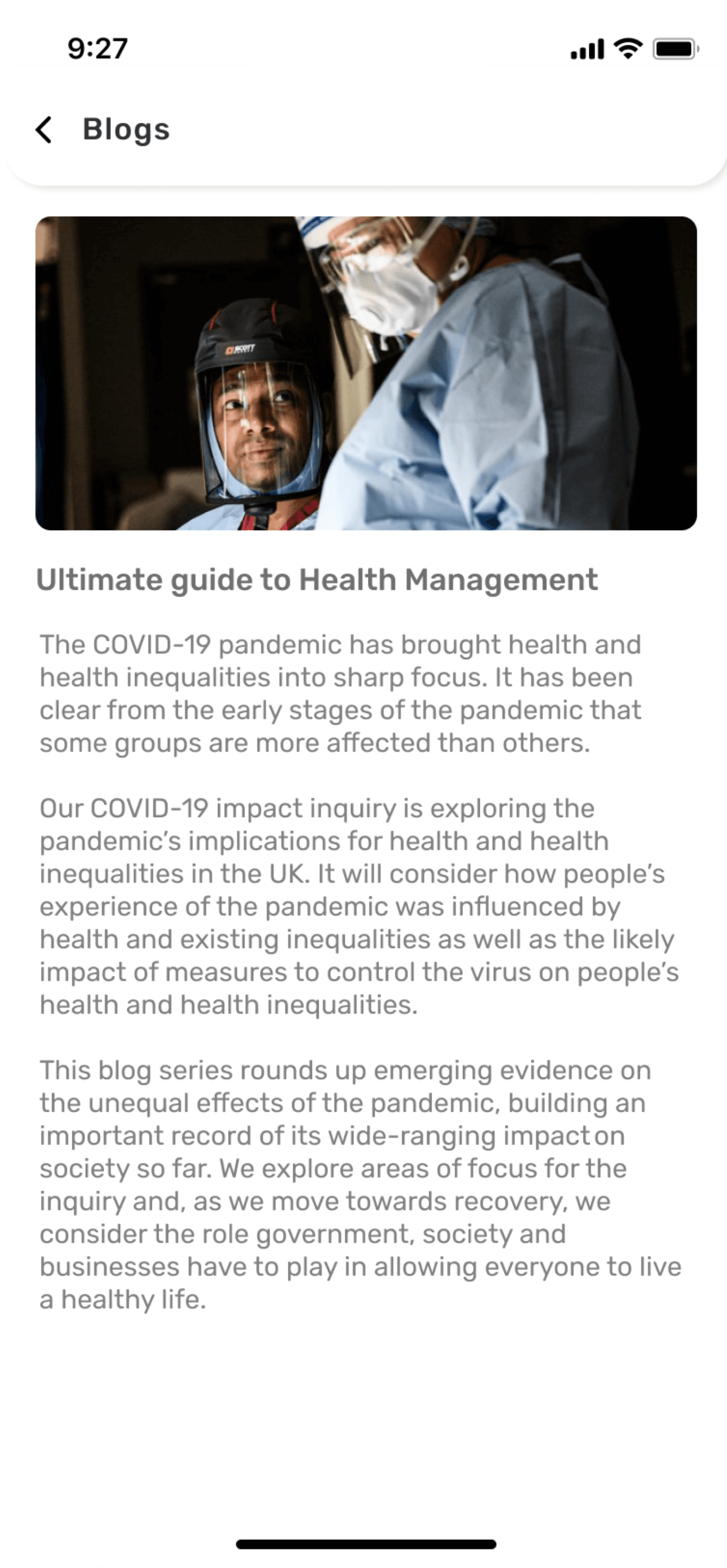
Health & Care related blogs.
Health & Care related posts & videos.
Text reader option
Option to save blogs and videos.
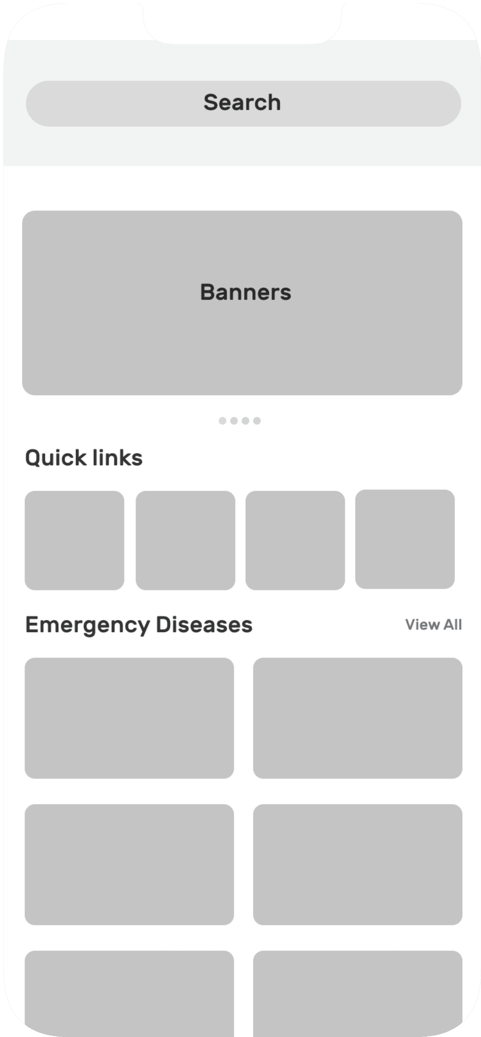
Information architecture
While establishing information architecture I found that it’s quite difficult to organise the some of the most important features to support discoverable and usability. The main goal of information architecture was to create simple and understandable navigation for users. It took lot of tries as there were lot of minute point which was must to be taken into consideration.
Homescreen
Log In/
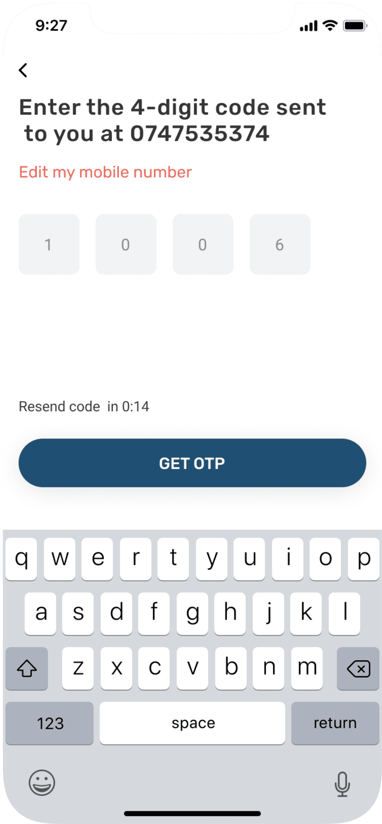
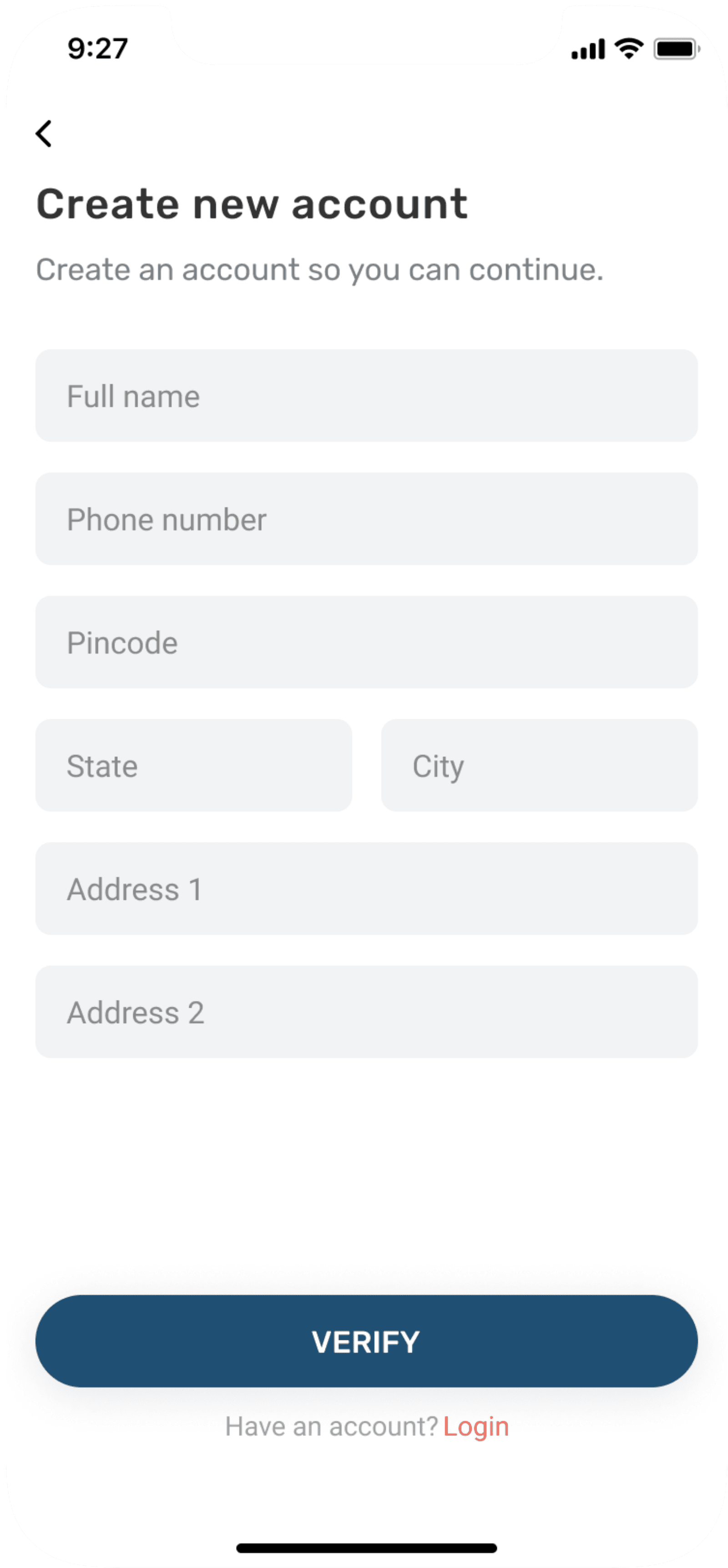
Sign up
Sign Up
Log In
Phone
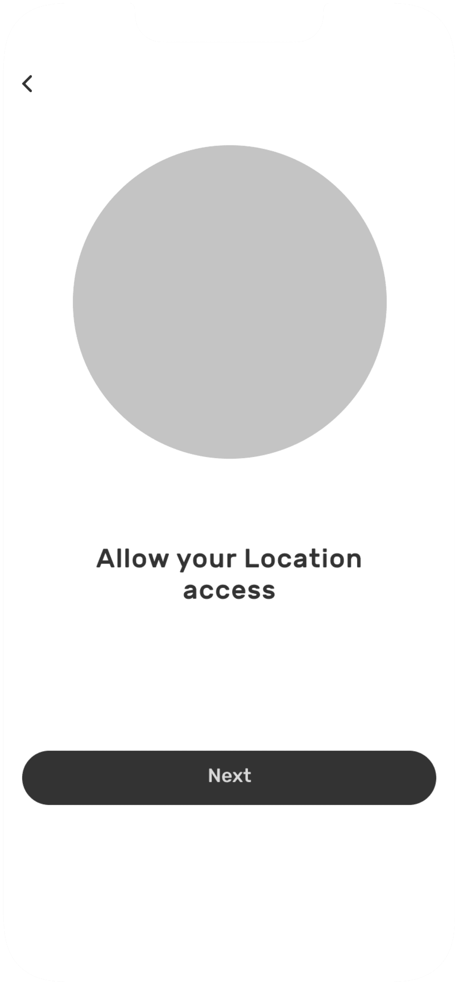
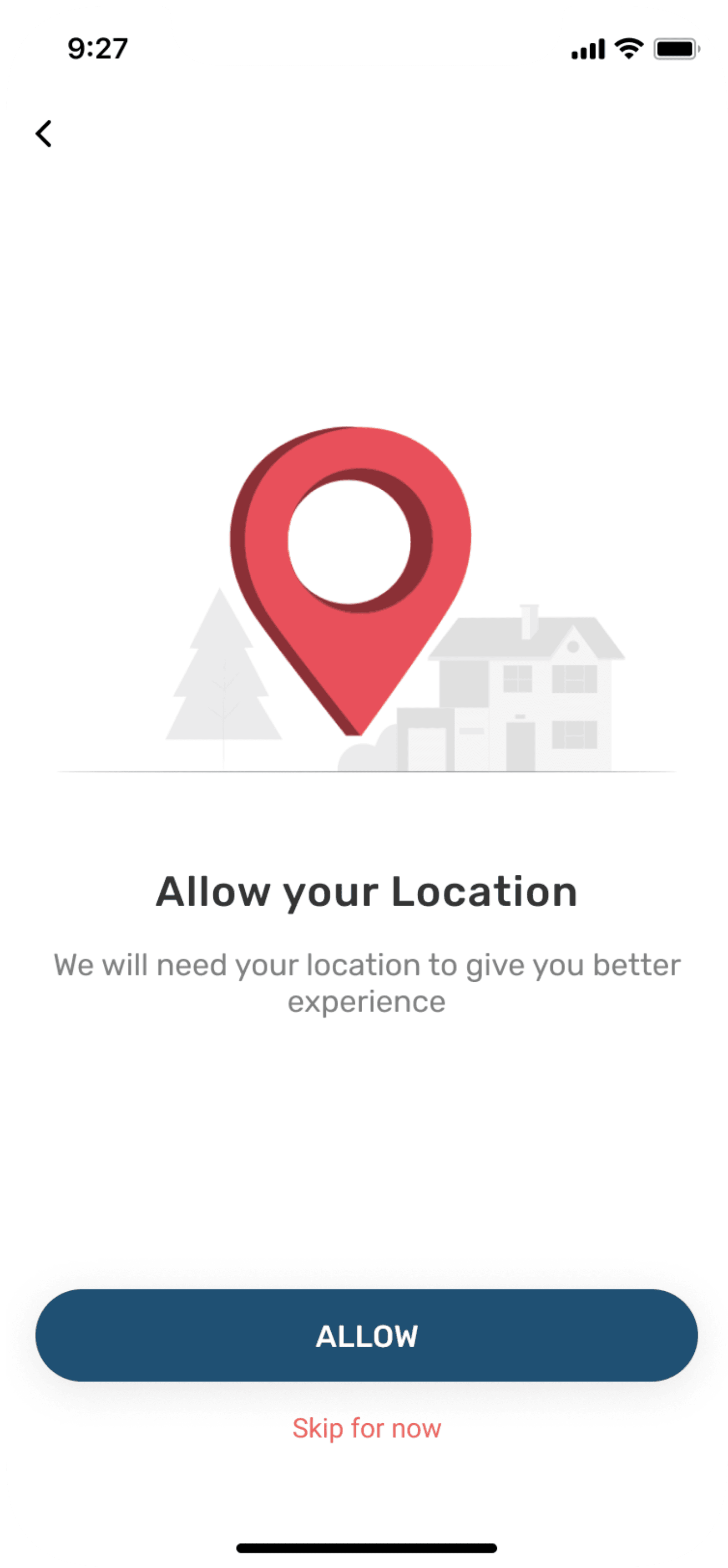
Location access
Phone
Skip
Top
Navigation
Top
Emergencies
Common
Symptoms
Bottom
Navigation
Quick links
Top Hospitals
Banners
Logo
Advertisement
List of
Hospitals
Nearest
hospital
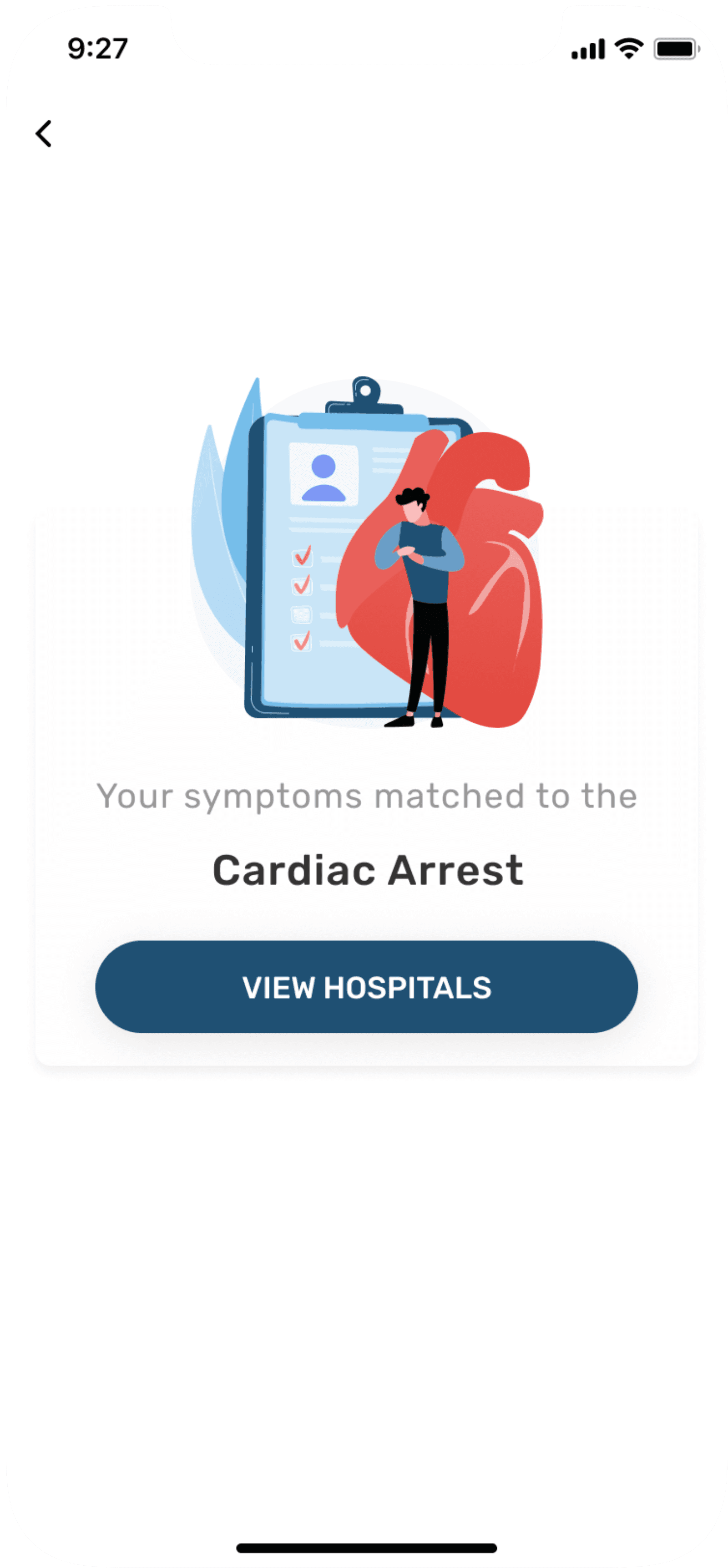
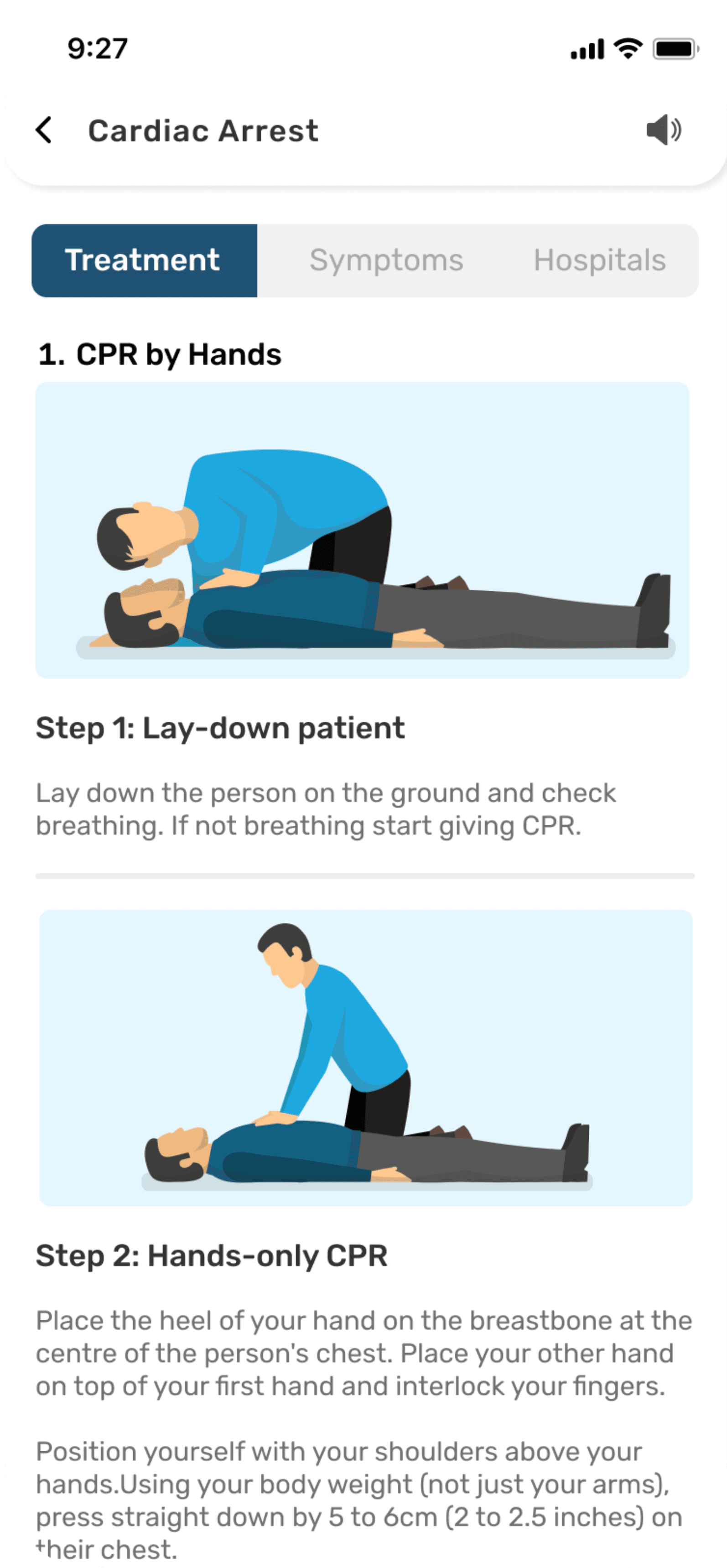
Cardiac
arrest
Headache
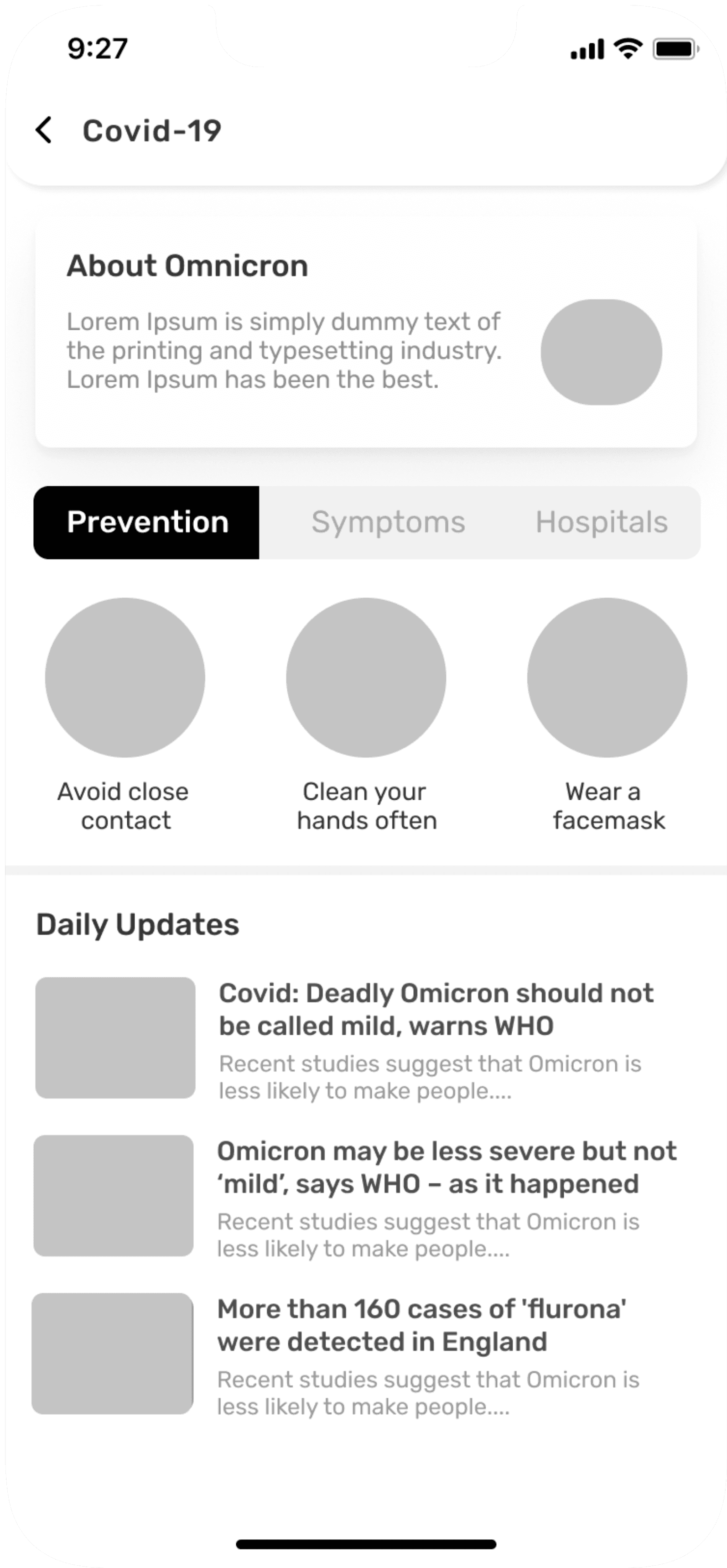
About
Type or
select
symptoms
Bone
Fracture
Vommitting
Through
Illustrations & text
Through Videos
Contact
Information
Fever
Treatment
Search
Nearest
pharmacy
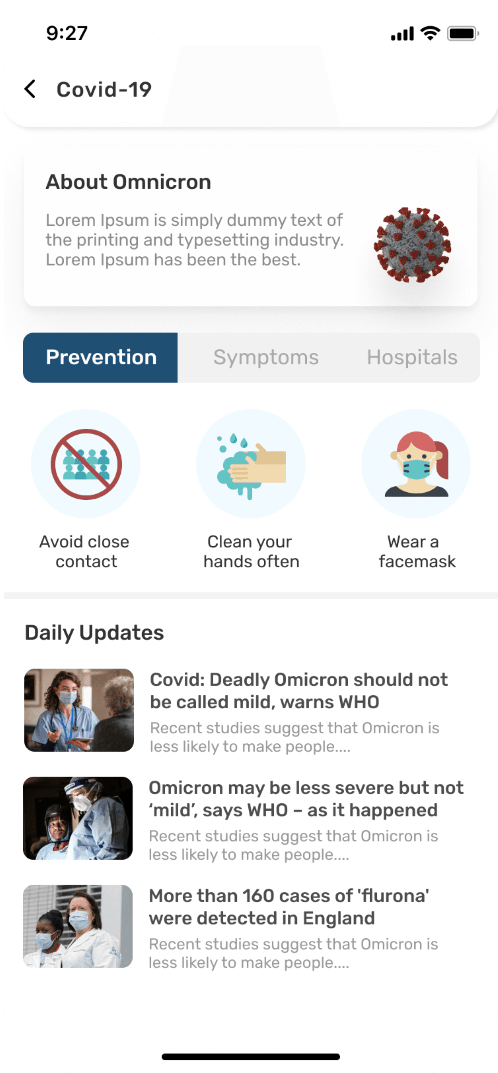
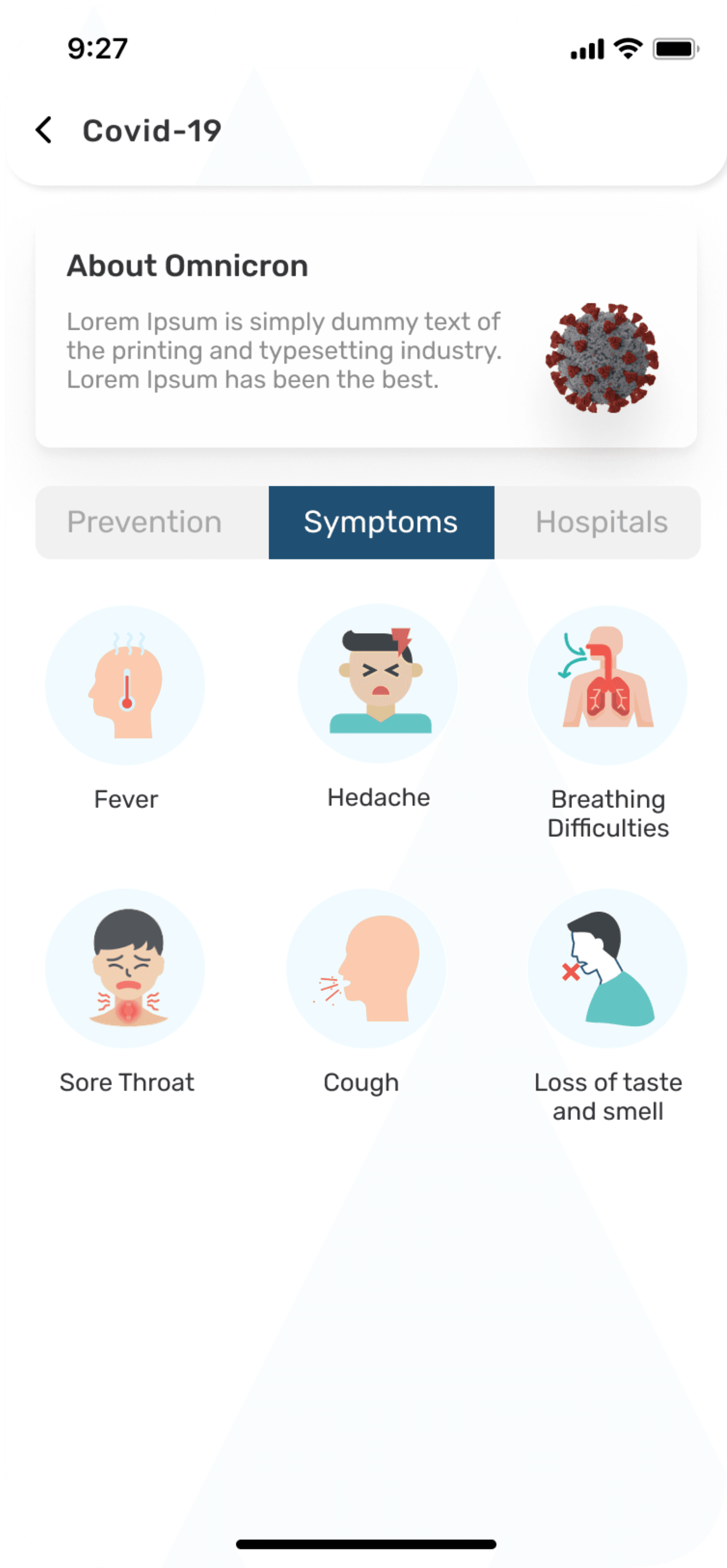
Covid 19
Name
Select
Disease
Treatment
Page
Stomach
Ache
Profile
Healthassist
Acne
Home
Joint pain
Notification
Emergency
contact
Age
Choking
Health &
Care
Sex
Stroke
Bleeding
Medical
Condition
Blogs
Wireframes
Once I organised all my insights from the ideation phase, I began to design application. I started with the several sketches of main home screen using my information architecture as a guide. This allowed me to quickly explore several concepts for the application layout and later I started designing wireframes in Figma.
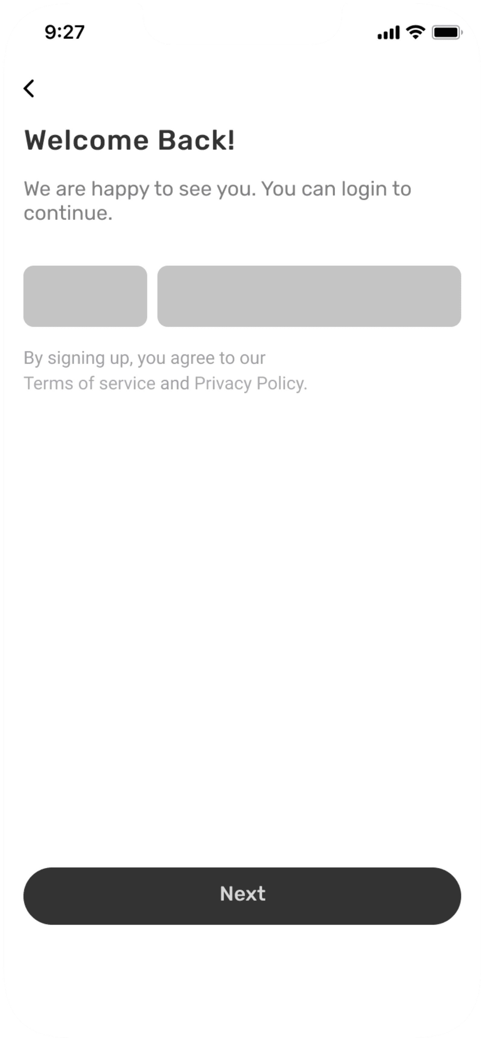
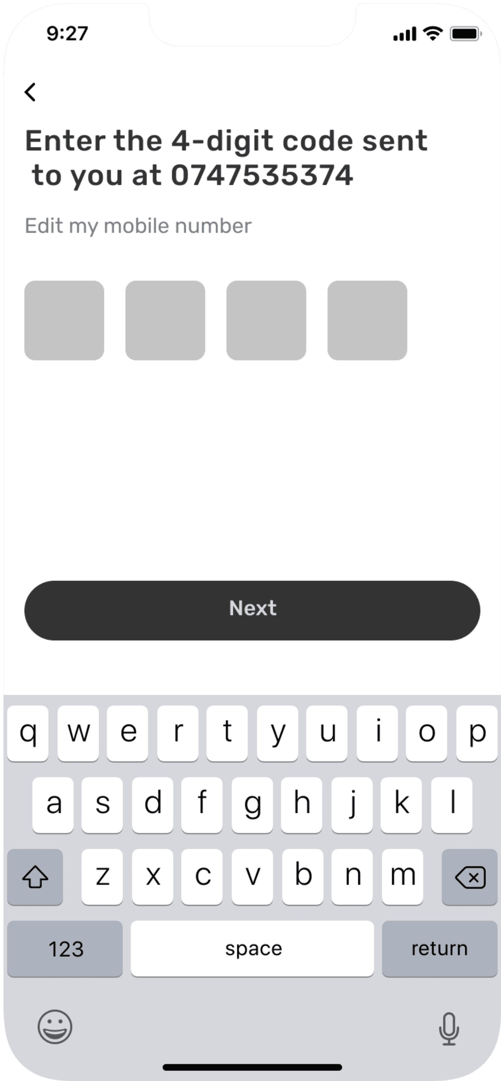
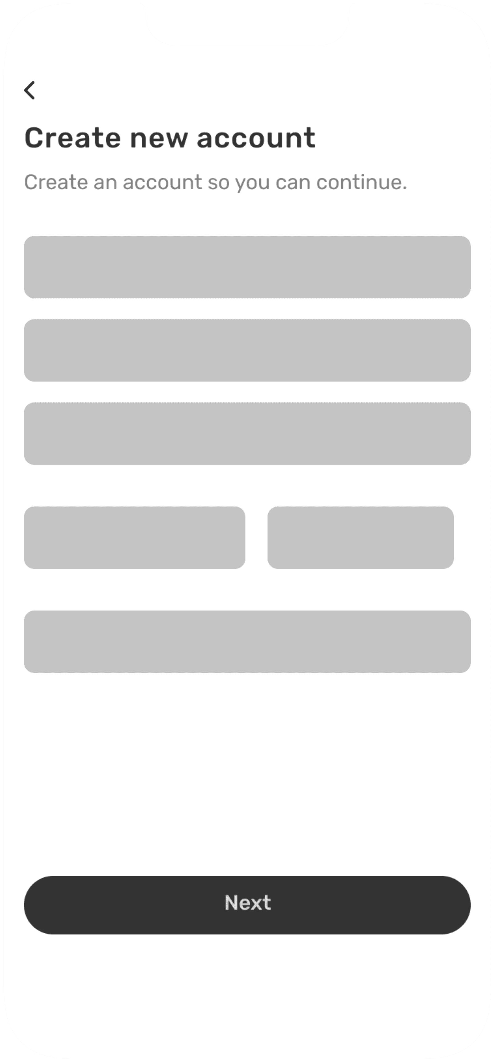
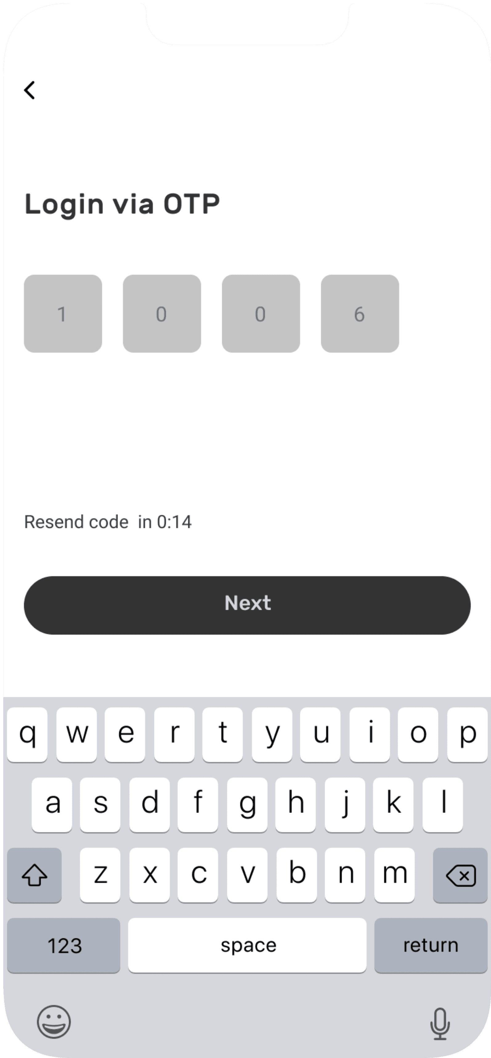
Login/Sign up screens
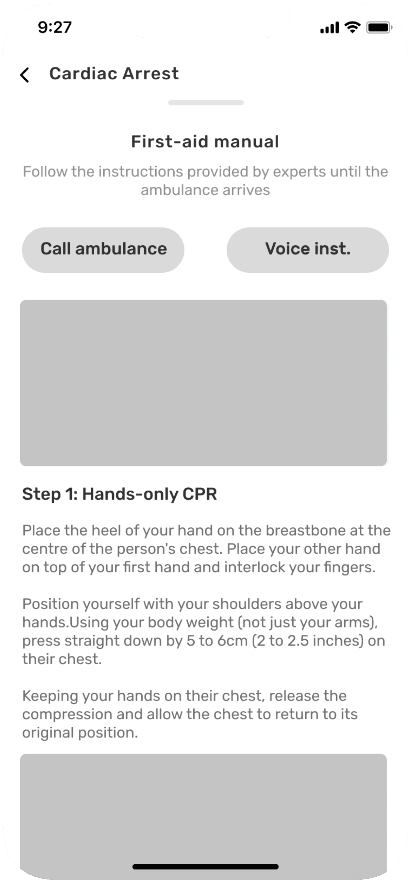
Emergency disease flow screens
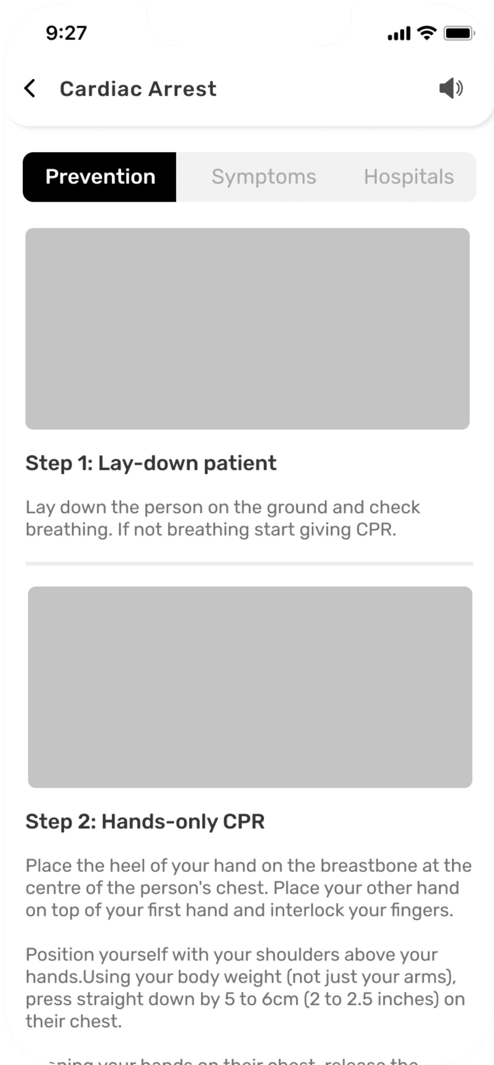

Emergency treatment flow screens
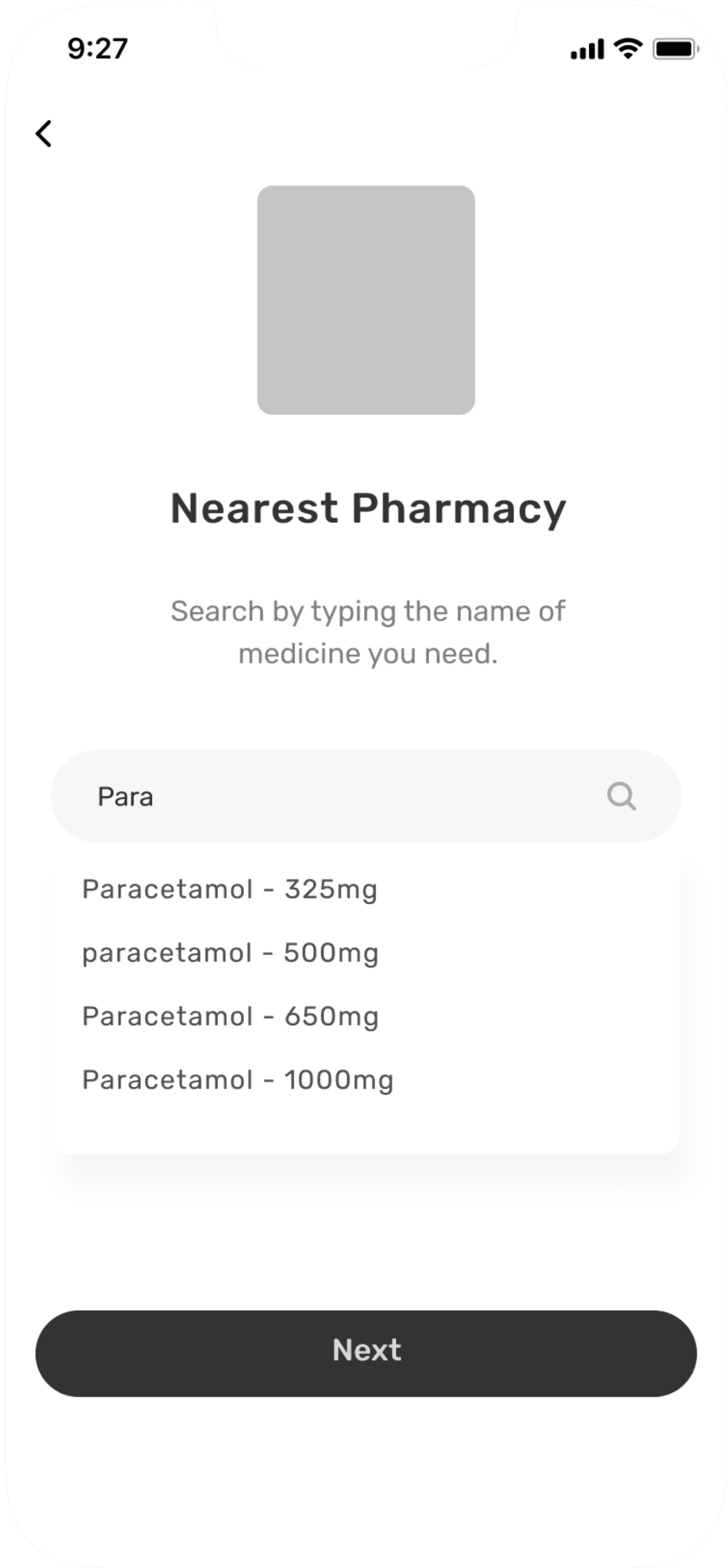
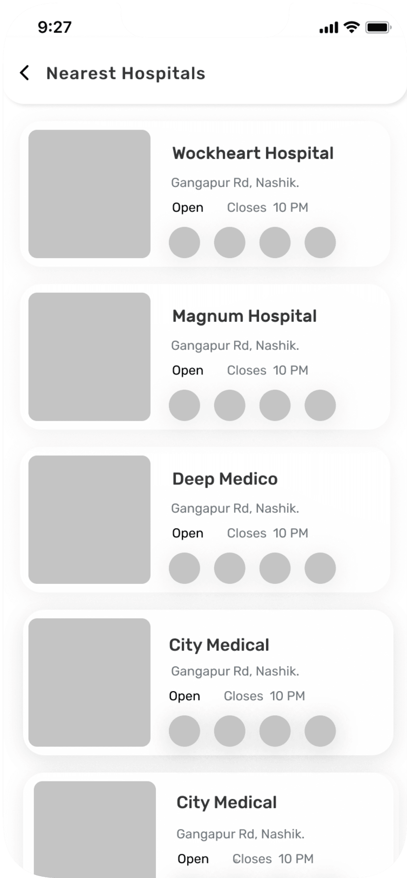
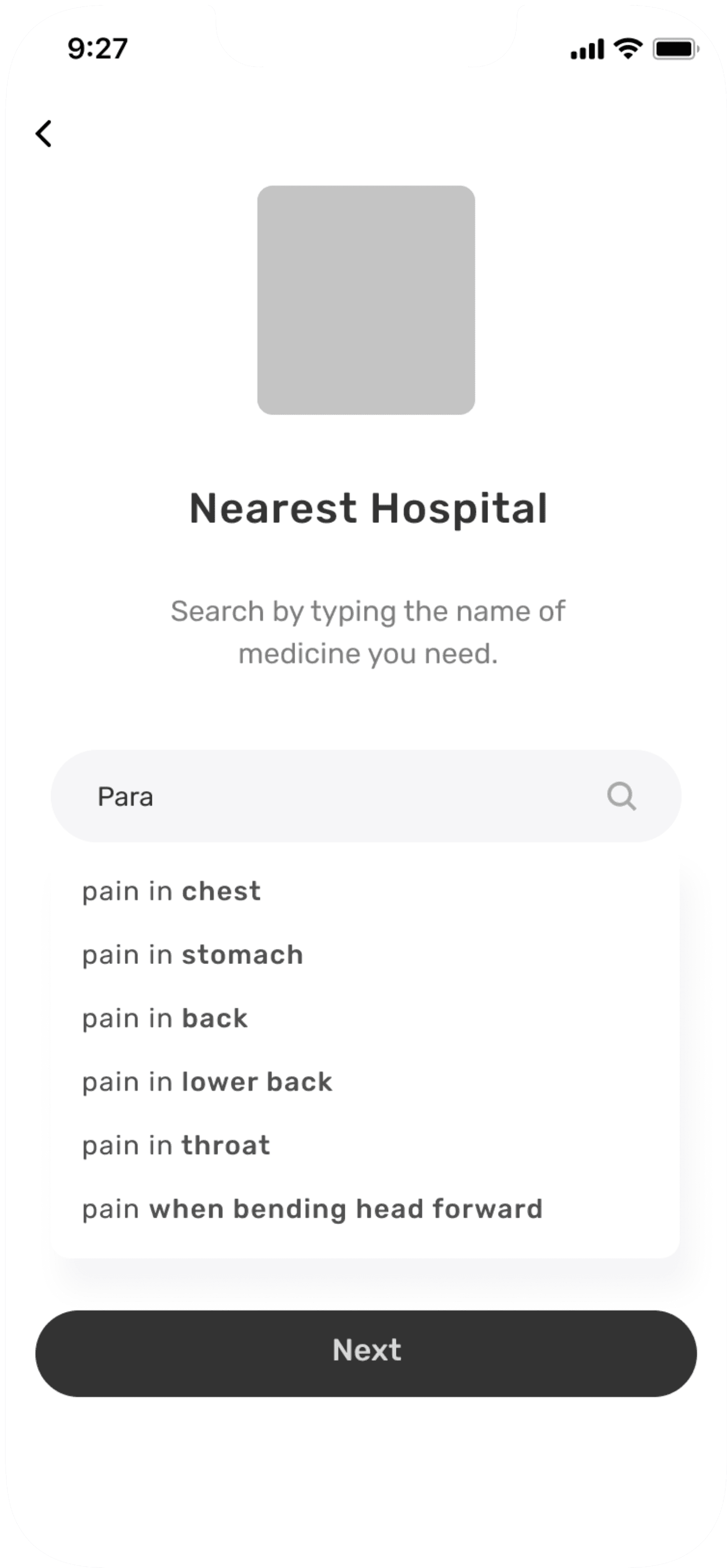
Nearest pharmacy flow screens
UI design
UI Components Library
I’ve created a colour palette with 3 primary, 2 secondary and 4 tertiary colours. The choice for typography has fallen on Inter, for better text readability.
With those elements added to my low fidelity wireframes, I made my way into high-fidelity designs.
Colour Palette
#1D5073
Primary
#3C749A
Primary
#6D9DC5
Primary
#BE2026
Secondary
#ED6657
Secondary
#F6E26E
Tertiary
#202528
Tertiary
#495058
Tertiary
#ADB6BE
Tertiary
Typography
Aa
Aa
Inter
Google Font
Regular
Medium
Semi Bold
Bold
Mobile
Font Size
Font Weight
Heading 1
20
Bold
Heading 2
16
Bold
Heading 3
16
SemiBold
Body 1
14
Bold
Body 2
14
SemiBold
Body 3
14
Medium
Body 4
12
Medium
Desktop
Font Size
Font Weight
Heading 1
20
Bold
Heading 2
16
Bold
Heading 3
16
SemiBold
Body 1
16
Bold
Body 2
14
SemiBold
Body 3
14
Medium
Body 4
12
Medium
I created Hi-fi designs once I mapped out app structure in wireframes. Below you can find screens for complete designed prototype.
Hi-fi designs
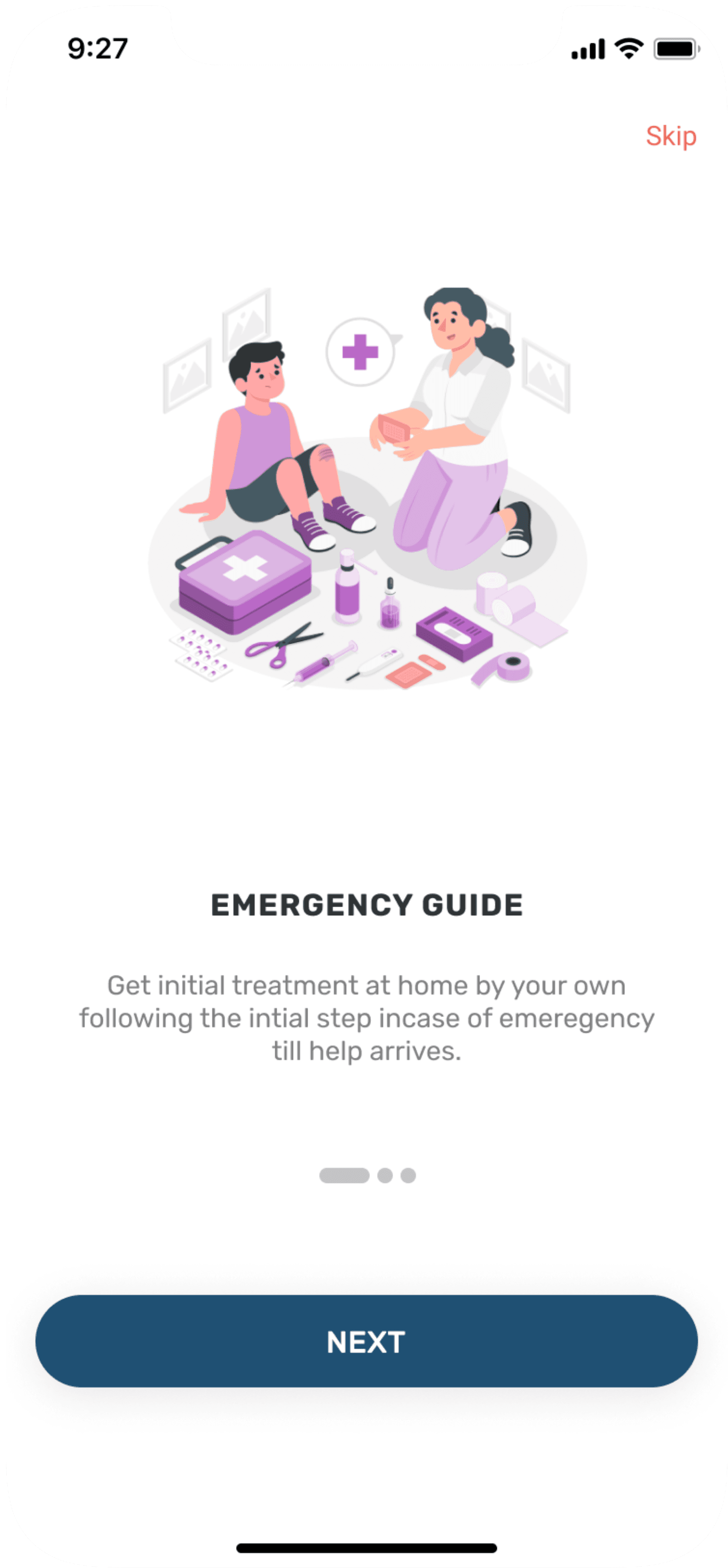
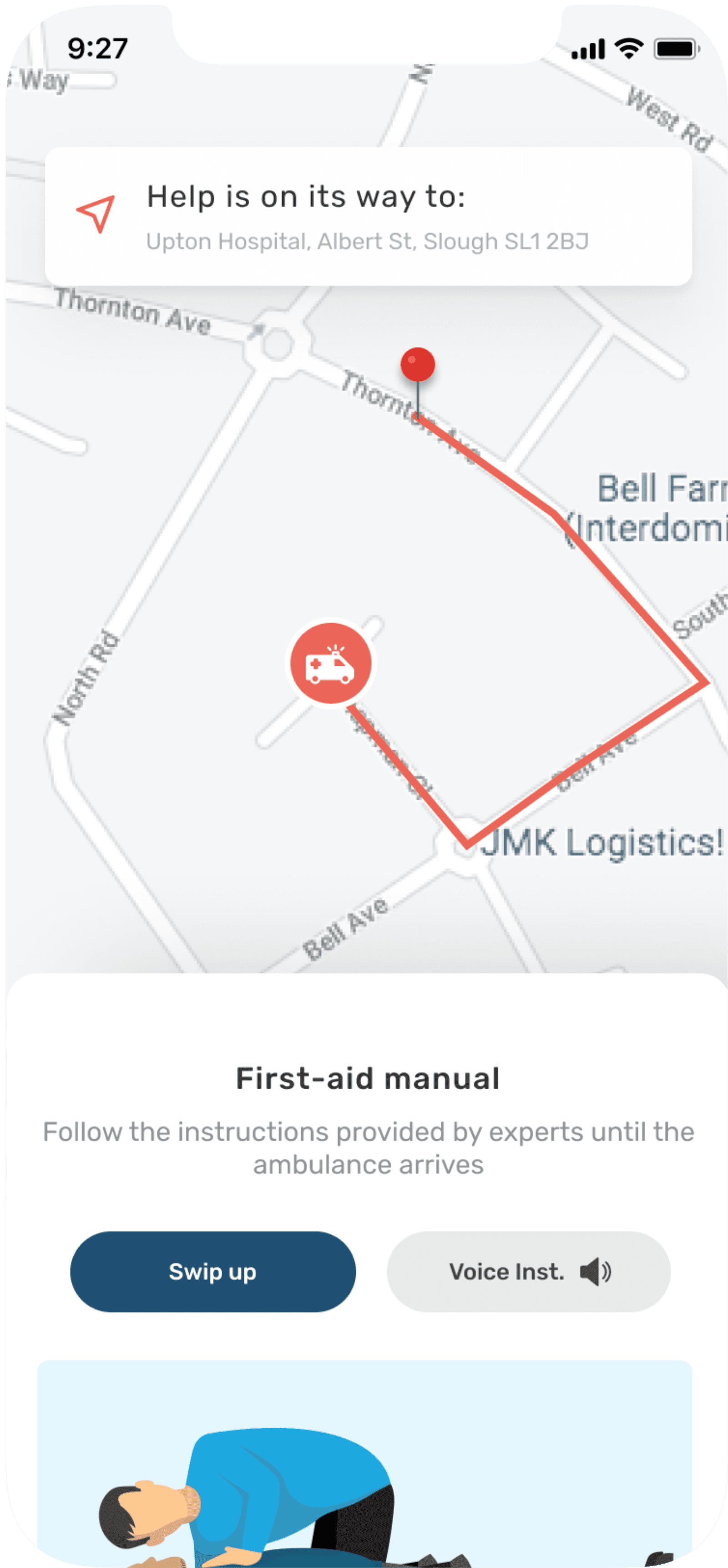
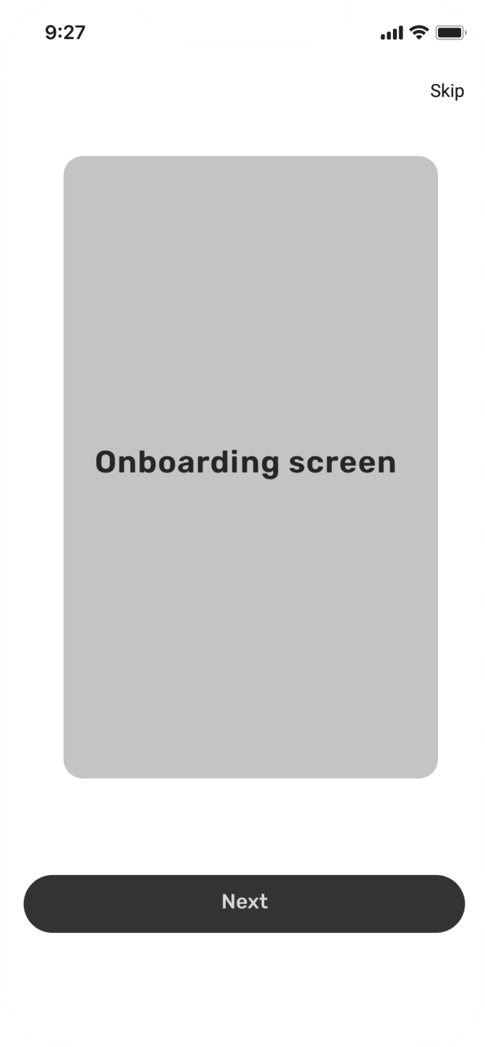
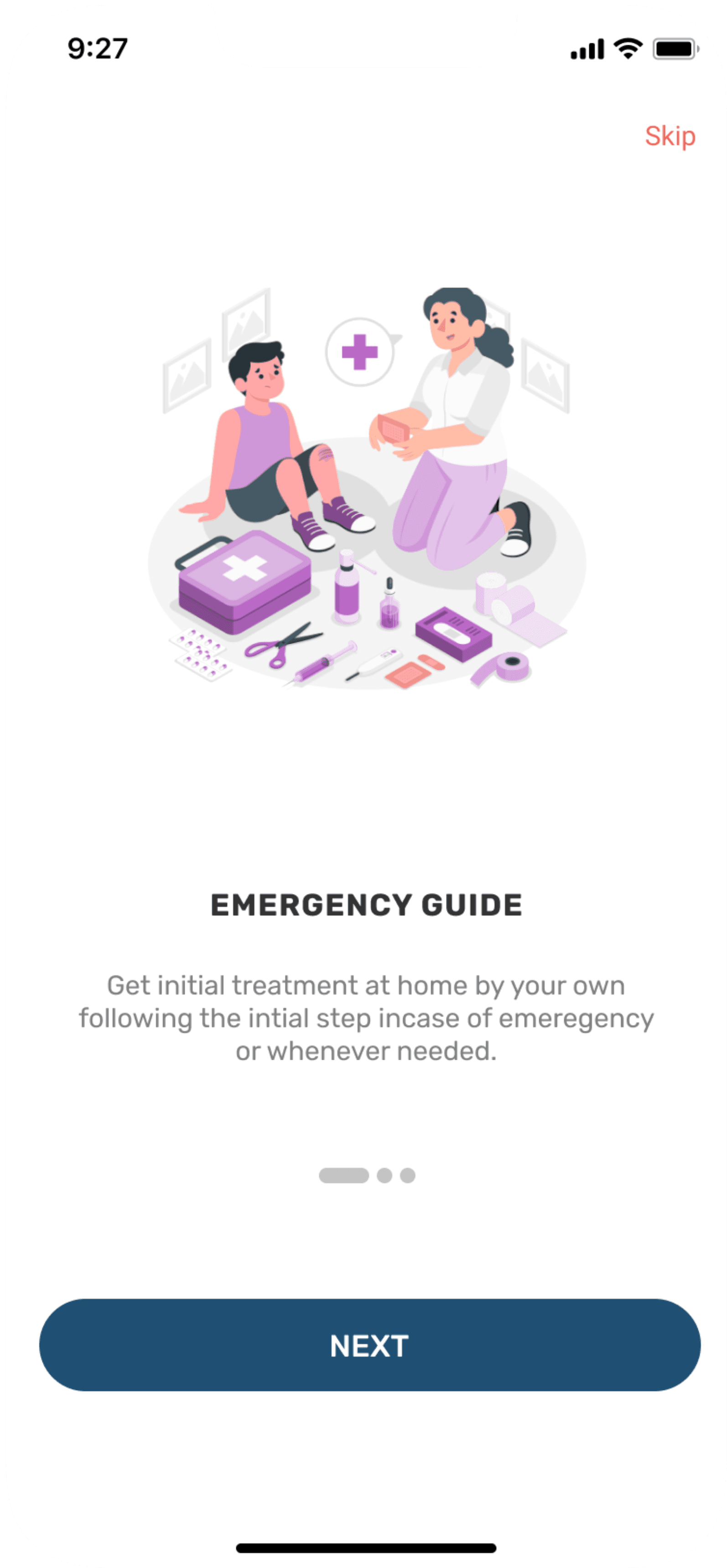
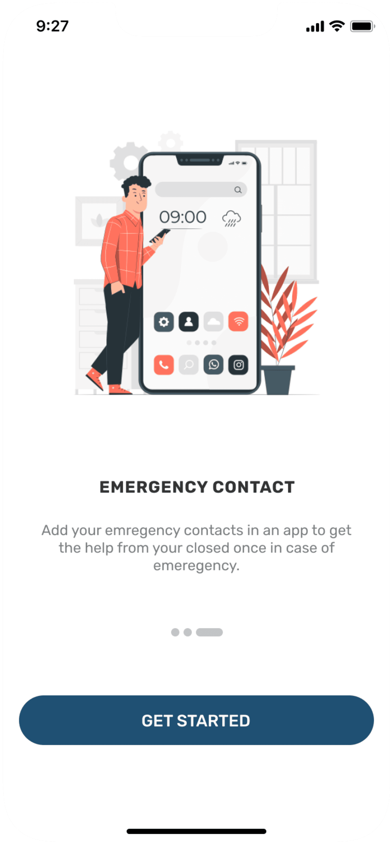
Splash screen & Onboarding screens


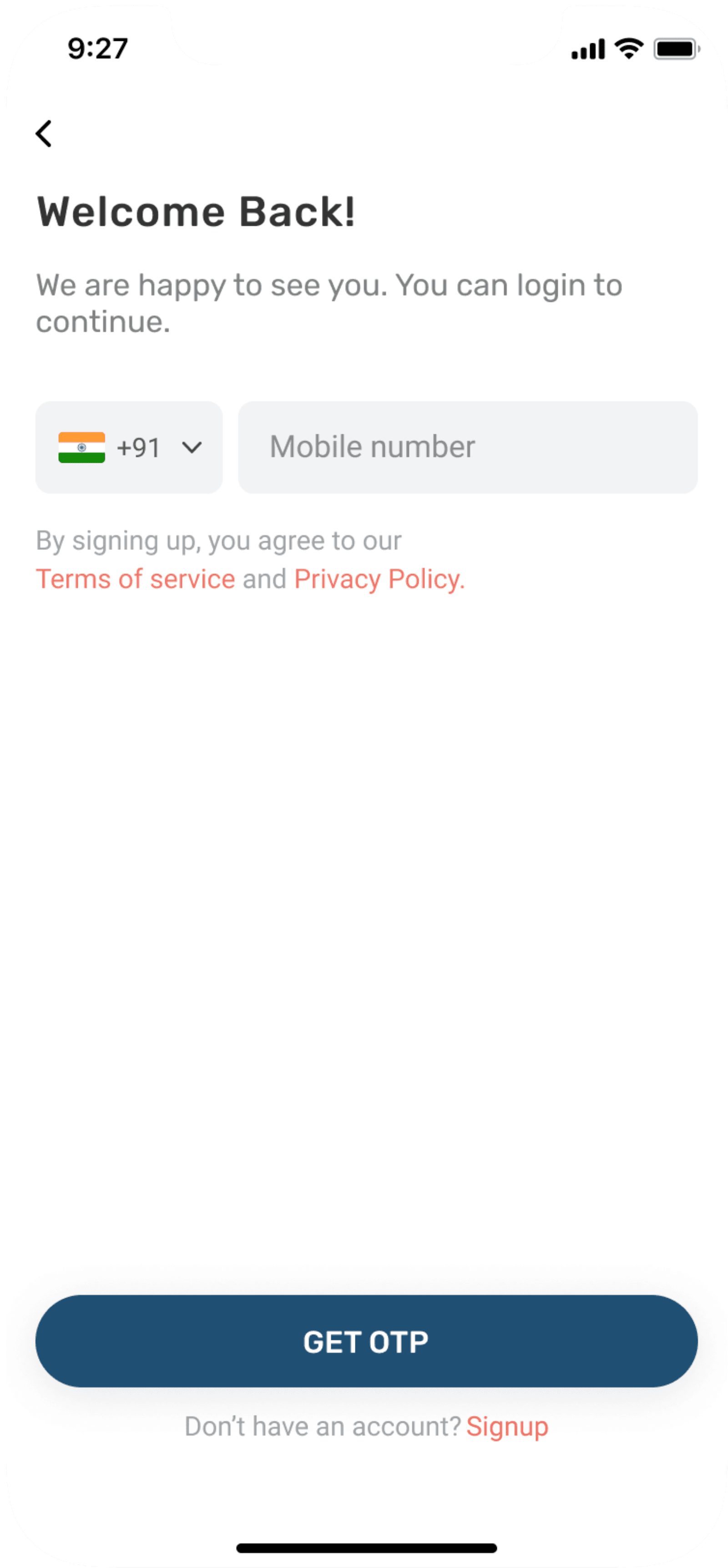
Login/Sign up screens
Homescreen & other screens


User testing
User questionnaire
This prototype was tested on 10 users using online testing platform called Maze. The link was sent to participants by which clicking on link they were redirected to user testing page. After usability testing participants were told to give feedback on Google forms. For that questionnaire were made as given below:-
Tell me your experience about using Healthassist app?
What Features were more useful in the app?
What does this feature mean to you?
Which features do you think are inappropriate or not that useful?
Do you think app has potential to fulfill user needs ?
How much would you rate the usability of app out of 10 and why?
User feedback
After successful usability testing, participants said they were able to use the app with ease and had seamless experience. There were few positive and negative feedbacks. This helped me to uncover opportunities to improve the overall user experience by building an effective and efficient experience for my users.
Positive Feedback
Loved the feature of detecting disease by typing symptoms, this will be very helpful for one in need.
Loved all the information provided about disease with text reader option and also with video option.
Color looks calm while going through application. Gives subtle feeling.
Negative Feedback
Blog part was irrelevant for me as I hardly noticed that section
I don’t like the color’s as it is giving the typical feel of being in hospital.
App should have option of automatically
detecting the location in case of emergency.
Feedback by Doctors
Very useful app especially in country like India where there is lack of medical facilities and knowledge. People have smartphones but no knowledge about healthcare. Suggestion I would like to give is try to incorporate SOS button on screen so that during accident the user will don’t have time to open the app because soon he will get unconscious, so by pressing that button he can send exact location and auto recorded message to his family members.
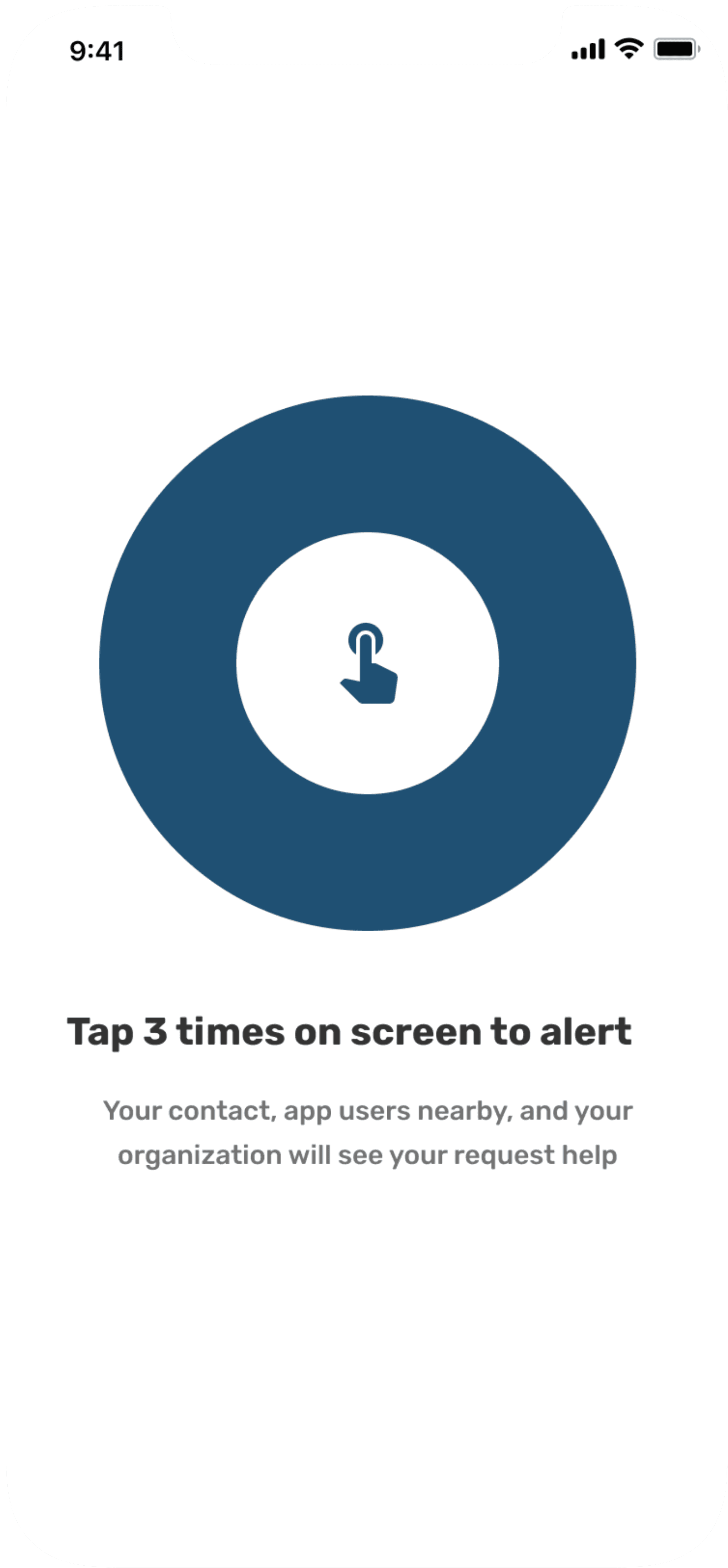
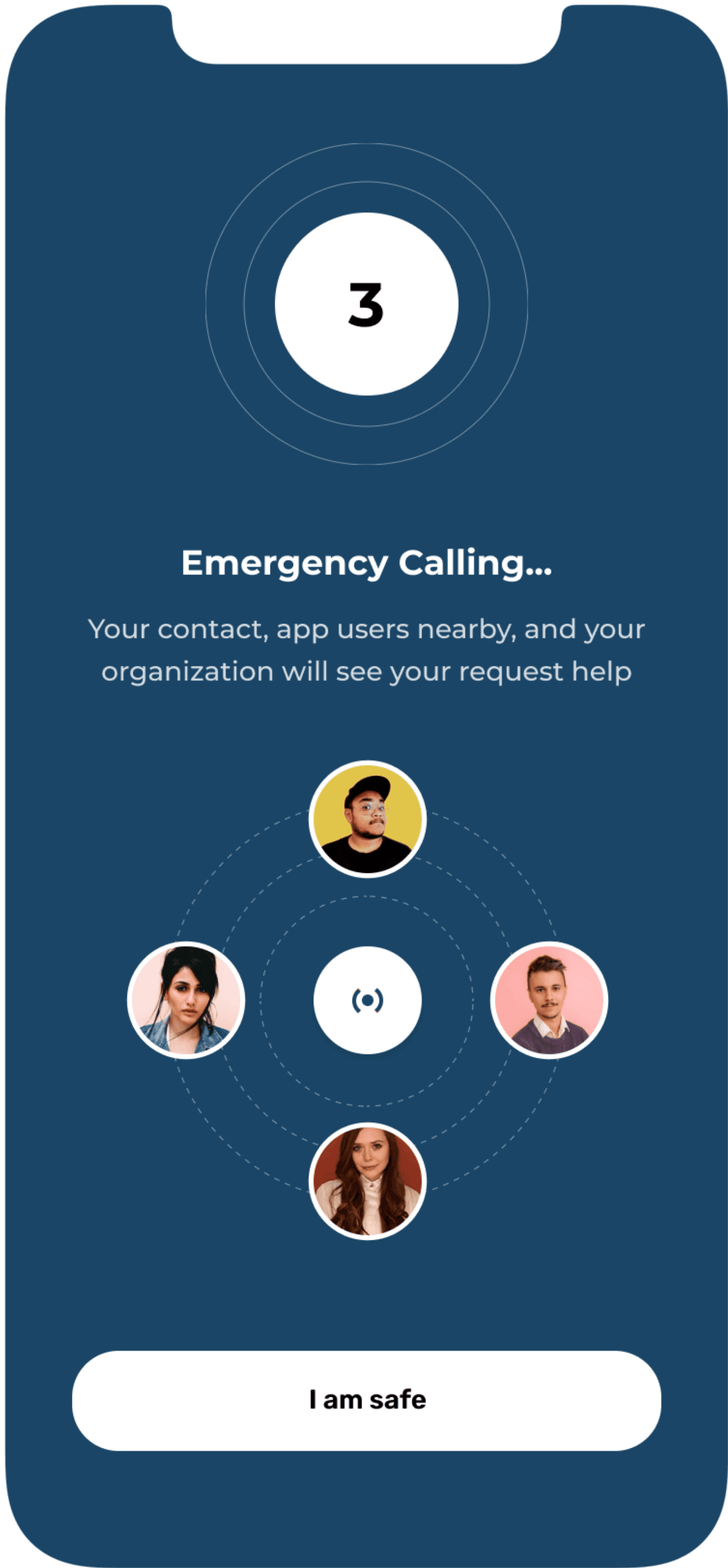
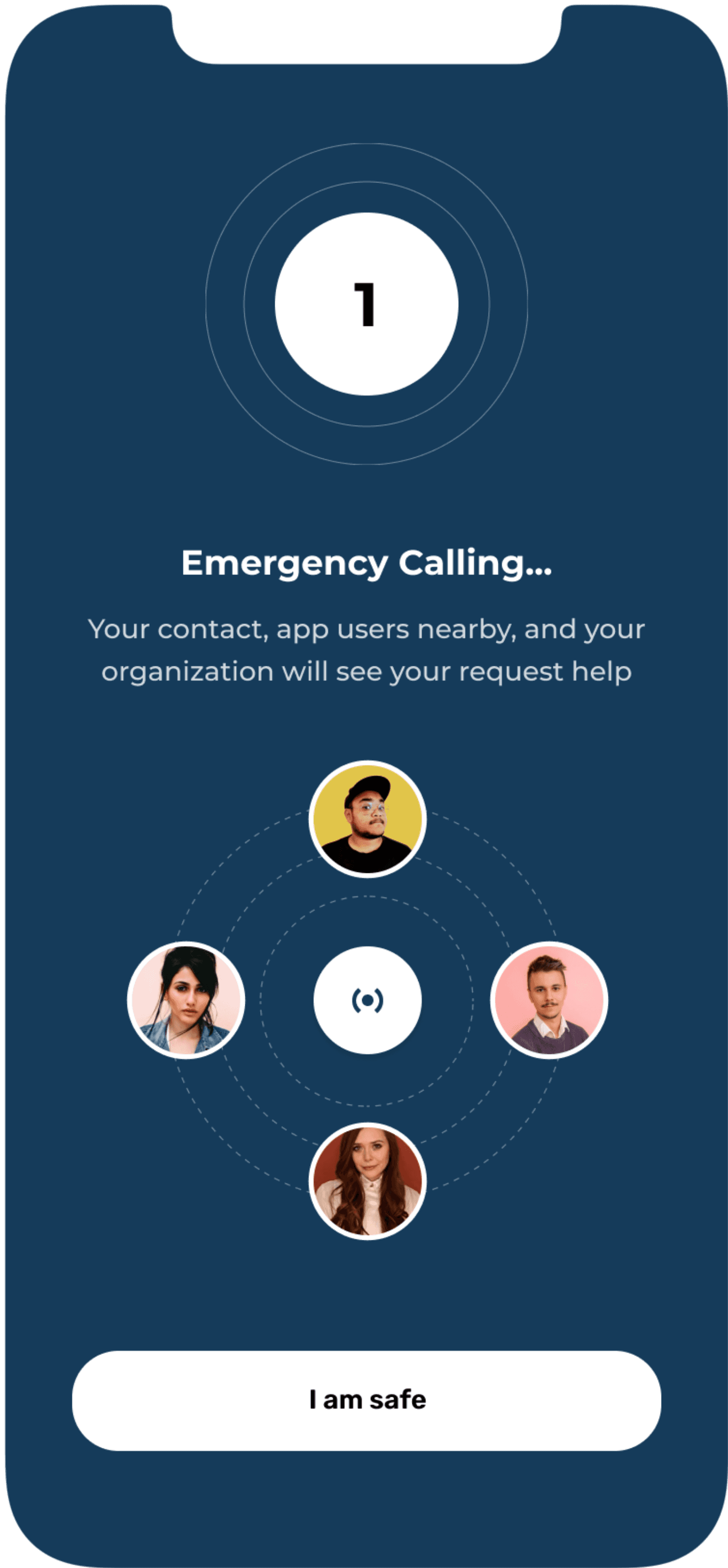
Revised screen
This feature has been updated based on the feedback given by professionals. This feature is like widget and
basically calling and sending emergency message to your closed ones if you are in emergency need. If you met
with an accident and you need help, you just have to tap three times on the screen and the emergency calling
will start on its own to the person who is closest to you in that period app will also send your location and
emergency message to the another people who you have added in your emergency contact list.

Key Takeaways
How solution solves the problem
I believe this platform will help people living in rural areas to get atleast basic knowledge about the self healthcare for free also they can find cure to any of their disease using application. There as some important features such as during emergency, in rural areas there are no ambulance if available it takes time to reach users address so meanwhile to stabilize his condition user can use this application by undertaking the precautions initially till help arrives.
My learnings
For me main takeaways from this project was “no design is perfect, there is always room for improvements”. After presenting case study it looks like everything was done in a specific manner but it wasn’t. There are some areas which needs to be explored more like the emergency disease section where I still find some missing elements about navigating from home screen to final treatment page. Throughout the project users were always taken into consideration as a core part of the design.
Learnt about importance of asking appropriate questions to the users to get correct data and not getting too much confused.
Learnt new tricks and features with figma which can definitely improve my work in next project.
designwithyuvraj@2025
HEALTHASSIST
A mobile app aimed at improving public awareness of self-healthcare by offering users accessible information on major and common diseases. The app also includes a location-based feature that helps users find nearby hospitals and pharmaceutical stores.
To see complete case study, view desktop version.
Role
UX/UI Designer
Owner
Self
Platform
Mobile
Toolkit
Figma, Figjam, Maze
Project kickoff
This project address the real life challenges in India about basic self health care. The project started with the background research where I user secondary research method and defined the problem statement.
Problem statement
India is 2nd largest highly populated country (2021) in the world but as compare to population, healthcare facilities provided are inadequate. India ranks 145th in quality and accessibility of health service globally where as many as one third of the deaths are preventable with timely communication about availability of medicines. Every year approximately 1.6 million people die in India due to lack of accessibility to healthcare facilities.
General research
Number of smartphones used in India - 748 Million in 2020 but people don’t have basic knowledge about self healthcare. Talking about facilities provided by government there is 1 Government doctor for every 11,082 people, 1 bed for every 1,844 people, 1 Government hospital for every 1,55,595 people. In some regions there are not even government hospitals which tends to death ratio to be more in that area. Catering this entire problem will cost lot of time so there should be something which will help to educate people to overcome the healthcare issues.
Design brief
Design a comprehensive healthcare app tailored for Indian users across urban and rural regions. The app provides accessible medical information to help users understand diseases and basic treatments, and includes a feature to locate nearby healthcare facilities offering the required care in both emergency and non-emergency situations.
My design process
Competitive analysis
In a competitive analysis phase, I assessed strength and weakness of current and potential competitor. I did a research looking for a similar applications and compared 5 apps of which 4 of them were strong and did the analysis to get useful insights from it also I noted negative comments from users on Android playstore to get essence of what user struggle most while using them and what they are not keen to.
Possible need
Need an app which will give basic knowledge or idea of first aid incase of emergency.
To create awareness about
healthcare system.
Suggest closest hospital nearby which has facilities available to
treat the patient.
Need to locate nearby pharmaceutical store which has medicines available as per the need.
Need to provide appropriate
information about home remedies & medicines to treat patient.
Rest UX methods used to gathered insights.
Created three different user personas and scenarios.
Mapped out and did Hierarchical task analysis.
I did Affinity Mapping exercise to categorise required information and features.
Mapped out information architecture to understand the structure of app to ensure clear navigation.
Design phase
Wireframes
Once I organised all my insights from the ideation phase, I began to design application. I started with the several sketches of main home screen using my information architecture as a guide. This allowed me to quickly explore several concepts for the application layout and later I started designing wireframes in Figma.
User testing
User questionnaire
This prototype was tested on 10 users using online testing platform called Maze. The link was sent to participants by which clicking on link they were redirected to user testing page. After usability testing participants were told to give feedback on Google forms. For that questionnaire were made as given below:-
Tell me your experience about using Healthassist app?
What Features were more useful in the app?
What does this feature mean to you?
Which features do you think are inappropriate or not that useful?
Do you think app has potential to fulfill user needs ?
How much would you rate the usability of app out of 10 and why?
Hi-Fi designs
I created Hi-fi designs once I mapped out app structure in wireframes. Below you can find screens for complete designed prototype.
Key Takeaways
How solution solves the problem
I believe this platform will help people living in rural areas to get atleast basic knowledge about the self healthcare for free also they can find cure to any of their disease using application. There as some important features such as during emergency, in rural areas there are no ambulance if available it takes time to reach users address so meanwhile to stabilize his condition user can use this application by undertaking the precautions initially till help arrives.
My learnings
For me main takeaways from this project was “no design is perfect, there is always room for improvements”. After presenting case study it looks like everything was done in a specific manner but it wasn’t. There are some areas which needs to be explored more like the emergency disease section where I still find some missing elements about navigating from home screen to final treatment page. Throughout the project users were always taken into consideration as a core part of the design.
Learnt about importance of asking appropriate questions to the users to get correct data and not getting too much confused.
Learnt new tricks and features with figma which can definitely improve my work in next project.
User feedback
After successful usability testing, participants said they were able to use the app with ease and had seamless experience. There were few positive and negative feedbacks. This helped me to uncover opportunities to improve the overall user experience by building an effective and efficient experience for my users.
Positive Feedback
Loved the feature of detecting disease by typing symptoms, this will be very helpful for one in need.
Loved all the information provided about disease with text reader option and also with video option.
Color looks calm while going through application. Gives subtle feeling.
Negative Feedback
Blog part was irrelevant for me as I hardly noticed that section
I don’t like the color’s as it is giving the typical feel of being in hospital.
App should have option of automatically detecting the location in case of emergency.
Feedback from doctors
Very useful app especially in country like India where there is lack of medical facilities and knowledge. People have smartphones but no knowledge about healthcare. Suggestion I would like to give is try to incorporate SOS button on screen so that during accident the user will don’t have time to open the app because soon he will get unconscious, so by pressing that button he can send exact location and auto recorded message to his family members.
designwithyuvraj@2025